
CAPE ratios by sector
Cyclically adjusted price-earnings ratios for the eleven sectors, calculated separately for the United States, global markets (global includes both developed & emerging markets) and global markets excluding the United States. Data available for the U.S. sectors since 1984.
CAPE answers one question well: is a sector expensive measured against its own past. It divides price by ten years of inflation-adjusted earnings, so a single good or bad year cannot move it. To compare a sector across markets use EV/EBITDA; to see what a sector is earning now, use P/E and earnings.
| United States | Global | Global ex-U.S. | ||||
|---|---|---|---|---|---|---|
| sector | Sept 2026 | Chg | Sept 2026 | Chg | Sept 2026 | Chg |
| Information Technology | 72.94 | +7.27 | 69.97 | +11.44 | 61.81 | +20.34 |
| Communication Services | 36.51 | -2.02 | 31.62 | -2.61 | 20.26 | -5.52 |
| Consumer Discretionary | 35.55 | -5.11 | 25.85 | -4.53 | 16.42 | -4.38 |
| Industrials | 33.69 | +0.92 | 31.36 | +0.93 | 29.21 | +0.90 |
| Real Estate | 32.57 | -0.39 | 21.07 | -0.80 | 13.77 | -1.09 |
| Energy | 29.79 | +2.45 | 20.99 | +3.85 | 15.17 | +3.16 |
| Health Care | 26.53 | +3.02 | 25.24 | +1.43 | 22.53 | -1.97 |
| Materials | 23.72 | -0.17 | 21.19 | +1.75 | 20.19 | +2.21 |
| Consumer Staples | 23.00 | -0.34 | 21.38 | -0.61 | 19.24 | -1.06 |
| Utilities | 20.20 | -3.27 | 20.05 | -1.08 | 19.89 | +1.21 |
| Financials | 19.66 | -2.07 | 17.20 | +0.20 | 15.63 | +1.76 |
Price divided by the average of the previous ten years of inflation-adjusted earnings. The ten-year window is what makes the measure stable, and also what makes it slow: a sector that has genuinely changed takes a decade to be fully reflected here.

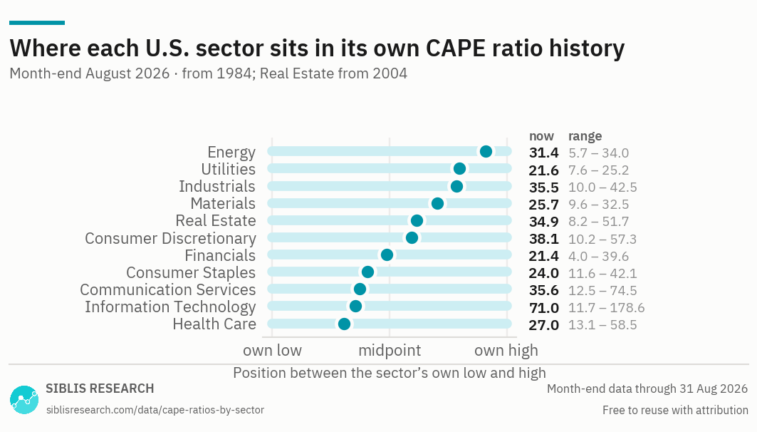
Position in a sector's own range is not the same as being cheap or expensive. Information Technology sits near the middle of its range only because that range includes the 1999–2000 peak; Energy sits near the top of its range partly because the earnings collapses of 2015 and 2020 are still inside its ten-year window.

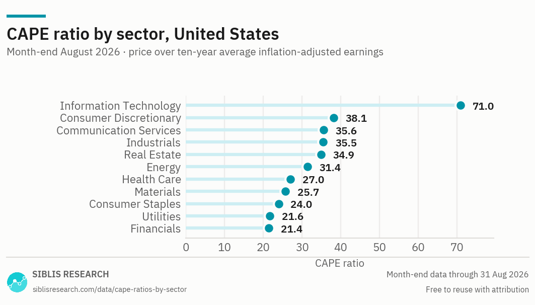
Ranked by current reading. Sectors are not directly comparable with one another on this measure — a sector with structurally higher earnings growth will carry a structurally higher CAPE, because the ten-year average sits further below current earnings.
| Month | Information Technology | Communication Services | Consumer Discretionary | Industrials | Real Estate | Energy | Health Care | Materials | Consumer Staples | Utilities | Financials |
|---|---|---|---|---|---|---|---|---|---|---|---|
| Sept 2026 | 72.94 | 36.51 | 35.55 | 33.69 | 32.57 | 29.79 | 26.53 | 23.72 | 23.00 | 20.20 | 19.66 |
| 2025 Dec | 64.46 | 39.77 | 40.28 | 32.62 | 31.80 | 26.36 | 25.77 | 23.73 | 22.98 | 22.82 | 21.69 |
| 2024 Dec | 58.96 | 34.58 | 41.11 | 29.03 | 32.10 | 27.05 | 24.38 | 22.83 | 23.63 | 21.01 | 20.74 |
| 2023 Dec | 48.56 | 27.82 | 34.19 | 26.62 | 33.06 | 26.78 | 25.68 | 24.19 | 22.13 | 18.33 | 17.41 |
| 2022 Dec | 34.42 | 20.23 | 25.73 | 24.73 | 32.52 | 31.71 | 27.95 | 23.79 | 23.69 | 21.18 | 17.21 |
| 2021 Dec | 56.94 | 41.28 | 45.83 | 29.07 | 51.66 | 20.64 | 33.45 | 31.89 | 26.81 | 23.01 | 23.22 |
| 2020 Dec | 50.06 | 40.51 | 41.28 | 25.69 | 41.24 | 11.63 | 30.77 | 27.69 | 25.62 | 21.83 | 21.30 |
| 2019 Dec | 38.88 | 37.14 | 33.27 | 24.60 | 48.29 | 16.50 | 29.61 | 24.34 | 24.92 | 22.93 | 24.99 |
| 2018 Dec | 29.98 | 33.33 | 30.28 | 20.84 | 43.75 | 14.82 | 26.87 | 22.39 | 21.14 | 19.17 | 26.68 |
| 2017 Dec | 34.80 | 45.95 | 34.52 | 25.98 | 45.81 | 16.69 | 27.82 | 27.54 | 25.41 | 19.78 | 37.42 |
| 2016 Dec | 27.97 | 42.62 | 31.24 | 22.79 | 41.74 | 15.37 | 24.97 | 22.57 | 24.38 | 18.65 | 27.12 |
| 2015 Dec | 27.27 | 44.47 | 32.96 | 20.66 | 42.48 | 10.81 | 28.11 | 19.24 | 25.17 | 17.04 | 20.30 |
| 2014 Dec | 28.64 | 44.69 | 32.74 | 22.83 | 43.09 | 13.88 | 28.42 | 21.59 | 25.45 | 19.11 | 19.05 |
| 2013 Dec | 26.79 | 47.60 | 32.53 | 22.52 | 33.20 | 16.28 | 24.43 | 21.67 | 23.83 | 15.70 | 15.52 |
| 2012 Dec | 24.48 | 36.95 | 25.14 | 17.43 | 32.33 | 14.48 | 18.75 | 19.08 | 20.60 | 14.74 | 11.12 |
| 2011 Dec | 28.56 | 43.54 | 23.48 | 16.83 | 26.28 | 15.87 | 17.58 | 18.78 | 20.40 | 15.34 | 8.61 |
| 2010 Dec | 38.22 | 48.31 | 25.07 | 18.67 | 23.47 | 16.62 | 17.67 | 24.29 | 19.98 | 14.32 | 10.32 |
| 2009 Dec | 36.83 | 40.75 | 20.18 | 15.57 | 17.11 | 14.89 | 19.10 | 20.41 | 19.42 | 14.14 | 8.65 |
| 2008 Dec | 23.95 | 29.22 | 14.00 | 14.19 | 13.18 | 15.29 | 17.96 | 13.79 | 18.94 | 13.59 | 6.51 |
| 2007 Dec | 46.00 | 45.96 | 21.55 | 26.10 | 24.36 | 28.10 | 25.68 | 28.55 | 24.10 | 20.63 | 14.15 |
| 2006 Dec | 43.71 | 47.18 | 27.30 | 26.42 | 33.75 | 25.93 | 27.29 | 26.67 | 23.28 | 18.48 | 19.76 |
| 2005 Dec | 45.80 | 32.69 | 24.95 | 26.18 | 25.84 | 26.28 | 28.53 | 24.13 | 22.35 | 15.90 | 18.55 |
| 2004 Dec | 51.20 | 35.83 | 28.42 | 28.48 | 23.87 | 24.40 | 30.16 | 24.96 | 23.91 | 14.20 | 19.91 |
| 2003 Dec | 59.29 | 36.14 | 27.56 | 26.63 | n/a | 21.89 | 34.04 | 24.80 | 24.74 | 12.01 | 20.42 |
| 2002 Dec | 49.01 | 33.78 | 23.51 | 22.48 | n/a | 19.53 | 33.49 | 20.42 | 24.88 | 9.90 | 17.42 |
| 2001 Dec | 67.04 | 38.37 | 36.83 | 34.99 | n/a | 24.46 | 46.67 | 26.14 | 29.11 | 15.33 | 22.63 |
| 2000 Dec | 79.75 | 44.18 | 39.78 | 40.65 | n/a | 32.69 | 57.58 | 25.12 | 34.19 | 22.21 | 27.79 |
| 1999 Dec | 165.96 | 70.09 | 57.26 | 41.88 | n/a | 31.33 | 47.06 | 31.11 | 32.35 | 15.14 | 25.92 |
| 1998 Dec | 102.93 | 67.81 | 47.85 | 36.90 | n/a | 25.67 | 58.21 | 23.32 | 41.89 | 17.69 | 27.75 |
| 1997 Dec | 59.82 | 47.85 | 34.67 | 35.25 | n/a | 27.82 | 43.64 | 24.00 | 39.49 | 15.44 | 29.27 |
| 1996 Dec | 51.76 | 38.22 | 27.08 | 30.84 | n/a | 25.79 | 33.13 | 23.77 | 33.13 | 12.99 | 23.53 |
The full monthly series from 1984, and the global and global ex-U.S. sector histories, are available to subscribers.
Closest to its own high
Sept 2026, United States
Where sector multiples stand, September 2026
In the United States, Information Technology is the most expensive sector on this measure at 72.9, and Financials the least at 19.7 — a spread of 3.7 to one.
Against its own past, Energy sits closest to its record, at 29.8 against a 1984–2026 high of 34.0 and a low of 5.7. Furthest from its own high is Health Care, at 26.5 against a high of 58.5.
What the ten-year window does, and what it costs
CAPE replaces one year of earnings with ten, adjusted for inflation. The point is to stop the denominator moving with the cycle. A sector whose earnings collapse in a recession shows a spiking P/E at exactly the moment it is cheapest; CAPE does not, because nine other years are still in the average.
The cost is that the measure has a ten-year memory, and the memory does not distinguish between a cycle and a change. A sector that has permanently re-based its earnings — upwards or downwards — will look wrong on CAPE for a decade afterwards, because the average is still carrying years that no longer describe the business.
Energy is the clearest live example. It sits close to the top of its own historical range, which reads as expensive. But its ten-year earnings average still includes the 2015–16 and 2020 collapses, which drags the denominator down and pushes the ratio up. The reading is arithmetically correct and would mislead anyone who took it as a valuation signal without looking at what is in the average.
Why sectors cannot be ranked against each other on CAPE
Comparing the valuations of different industries can be tricky due to the diverse economic trends and growth prospects across sectors. Each industry operates under unique conditions that influence its valuation, making direct comparisons difficult. For example, technology companies have much higher growth expectations compared to more stable sectors like utilities, leading to higher CAPE ratios for tech stocks. This reflects the market’s optimism about long-term growth potential in technology, even though earnings may fluctuate more significantly than in other sectors.
Furthermore, some industries are more cyclical than others, meaning their performance is closely tied to economic conditions. For instance, Consumer Discretionary companies, which rely on consumer spending that varies with economic cycles, are more sensitive to economic booms and busts than Consumer Staples companies. The cyclicality of certain sectors causes their earnings to swing more widely, which, even with the 10-year smoothing effect in the CAPE ratio, can still influence the metric’s accuracy.
The CAPE ratio works most effectively when used to compare a sector’s current CAPE ratio to its historical average. This approach provides a clearer picture of whether a sector is overvalued or undervalued in relation to its own long-term trends, accounting for factors like cyclical fluctuations. By examining the current ratio in this context, investors can better assess whether the sector’s valuation is reasonable or if market sentiment is overly optimistic or pessimistic.
Crossing borders
CAPE travels between markets worse than most multiples. It is built on net earnings, so it absorbs every difference in corporate tax rates and in how much debt a market's companies carry. It is also inflation-adjusted over ten years, which means two markets with different inflation histories are not adjusting the same quantity.
The three-universe table above is published because the comparison is asked for and the series exist. It should be read as three separate histories rather than as a like-for-like ranking. For a cross-market sector comparison that is methodologically sound, use EV/EBITDA.
Two sectors that were redefined
Two of the eleven sectors are younger than the ten-year earnings window this measure needs, and it is worth knowing how each is handled.
Communication Services is a recent sector. Its earnings history is built from the companies that were part of the sector when it was first launched, carried back through time — so the series describes that group of companies, not whatever an older classification would have called them.
Real Estate was separated out of Financials relatively recently. The historic Financials CAPE here is calculated using Financials companies only, with real estate excluded throughout. The two series therefore do not overlap at any point in the history, and adding them back together would not reproduce the old combined sector.
Choosing a measure
No single ratio answers every question about a sector. Each of these pages covers the same eleven sectors — what changes is the question the measure is good at, and how far the coverage reaches.
| Measure | The question it answers | Why that one |
|---|---|---|
| EV/EBITDA | How does one sector compare across markets? | Sits above tax and debt, so it survives crossing borders. The only measure here that makes an international sector comparison sound. |
| P/E and earnings | How fast are a sector’s earnings growing? | Trailing and forward multiples with the earnings behind them, so the multiple and its denominator can be read together. |
| CAPE this page | Is a sector expensive against its own history? | Averages a decade of real earnings, which smooths the cycle out of the denominator. |
| Price to book | What is the market paying for the assets? | Works where earnings-based measures break down — asset-heavy sectors, and banks in particular. U.S. sectors only. |
| Dividend yield | Which sectors pay, and how much? | Income rather than valuation, but it moves inversely with price and is read alongside the multiples. U.S. sectors only. |
Where this data is used
Some examples. Siblis valuation data appears in peer-reviewed journals, central bank publications and the financial press.
Four decades of sector history, in one file
This page publishes thirty year-ends for the U.S. sectors and the current reading for the global and global ex-U.S. universes. The subscription is the whole series.
How this is calculated
Price divided by the average of the previous ten years of a sector's aggregate inflation-adjusted earnings — the sector-level equivalent of the cyclically adjusted price-earnings ratio.
- Earnings — Aggregate trailing twelve-month earnings of the sector's constituent companies, normalised: major purely accounting gains and losses are removed.
- Inflation adjustment — Each year's earnings are restated in current money before averaging.
- Coverage — Eleven sectors for the United States, global and global ex-U.S. markets. U.S. history begins in 1984; Real Estate begins in 2004.
- Communication Services — Earnings history is built from the constituents of the sector as first defined, carried back through time.
- Financials — Calculated on Financials companies only. Real estate companies are excluded across the whole history, not only after the two were separated.
- Revisions — Figures are point-in-time. If a company later restates its results, the historic reading is left exactly as first published: the series reflects what was known at the time, not what is known now.
Cite this page
Siblis Research. (2026). CAPE Ratios by Sector [Data set]. Retrieved 30 September 2026, from siblisresearch.com/data/cape-ratios-by-sector/
@misc{siblis_cape_ratios_by_sector,
  title={CAPE Ratios by Sector}, author={{Siblis Research}},
  year={2026}, url={https://siblisresearch.com/data/cape-ratios-by-sector/},
  urldate={2026-09-30}}
Charts on this page may be reproduced free of charge with attribution to Siblis Research and a link to this page.