
Russell 2000 P/E ratio, CAPE and earnings growth
Valuation ratios and earnings growth for the Russell 2000 index, shown next to the four other U.S. indices carried here: large caps, the NASDAQ 100, growth and value.
Small caps carry the highest trailing P/E of the five, at 37.84 against 26.08 for large caps. That is the opposite of what most people expect, and it is not mainly a statement about how expensive small companies are. It is a property of how an aggregate ratio treats companies that lose money — explained below, because nothing else on this page makes sense without it.
| Valuation | Earnings growth | ||||||
|---|---|---|---|---|---|---|---|
| Index | Trailing P/E | Forward P/E | Implied | CAPE | 1 year | 3 yr p.a. | 5 yr p.a. |
| Russell 2000 | 37.84 | 25.54 | +48.2% | 64.92 | +8.3% | +4.6% | +27.1% |
| U.S. Large Cap | 26.08 | 20.13 | +29.6% | 36.41 | +12.9% | +10.4% | +12.3% |
| NASDAQ 100 | 34.24 | 22.85 | +49.8% | 57.82 | +49.2% | +27.5% | +18.2% |
| Russell 1000 Growth | 35.60 | 23.27 | +53.0% | 53.43 | +20.9% | +19.2% | +11.7% |
| Russell 1000 Value | 22.48 | 16.83 | +33.6% | 25.73 | +14.3% | +5.2% | +5.4% |
Implied is the earnings growth the market has already priced in: trailing P/E divided by forward P/E, minus one. Earnings growth is the compound annual change in aggregate index earnings, nominal, not adjusted for inflation. All five indices are U.S. listings, so currency is not a factor in this table.


This chart uses CAPE rather than the trailing P/E, for the reason set out below: small cap aggregate earnings nearly vanished in 2021 and the trailing multiple ran into the hundreds, so a line containing it says nothing about any other year. The lower panel is the small cap CAPE divided by the large cap one — today's 1.78 against a median of 2.37 since 2006.

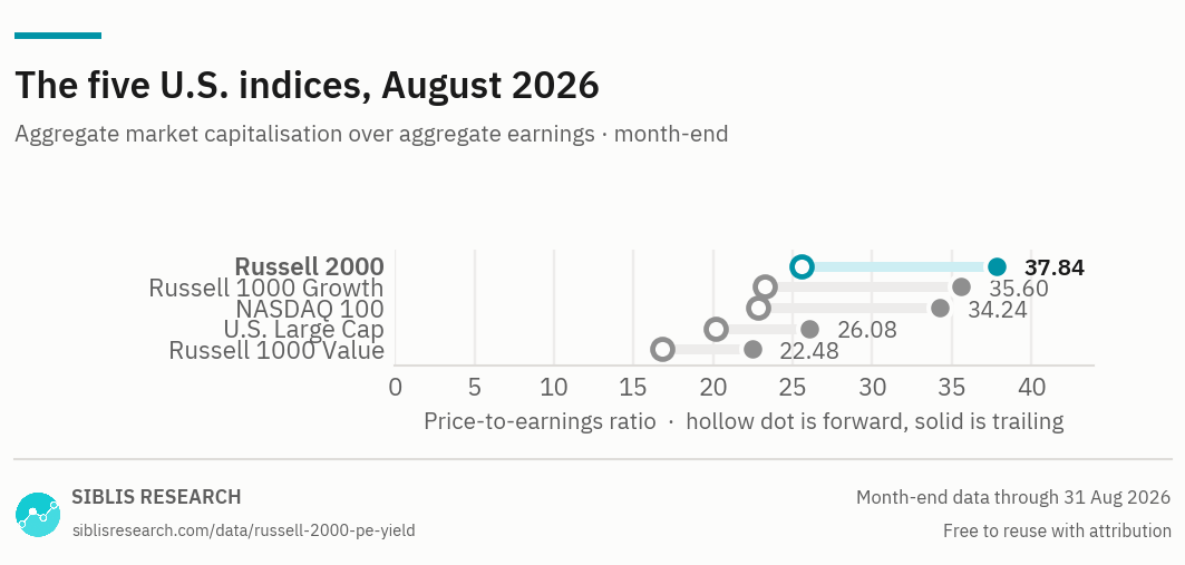
The hollow dot is the forward multiple and the solid dot the trailing one. Small caps sit at the top of the trailing scale and well down the forward one, which is the same effect as everything else on this page: loss-makers weigh on trailing earnings, and consensus expects them to weigh less on next year's.
| Month | U.S. Large Cap | NASDAQ 100 | Russell 2000 | Russell 1000 Growth | Russell 1000 Value |
|---|---|---|---|---|---|
| Aug 2026 | 26.08 | 34.24 | 37.84 | 35.60 | 22.48 |
| 2025 Dec | 25.38 | 32.32 | 35.52 | 39.32 | 20.76 |
| 2024 Dec | 24.61 | 32.36 | 33.44 | 38.82 | 19.62 |
| 2023 Dec | 21.79 | 30.25 | 26.72 | 34.46 | 16.36 |
| 2022 Dec | 18.55 | 23.72 | 51.74 | 24.13 | 14.71 |
| 2021 Dec | 26.14 | 38.00 | 67.53 | 35.86 | 17.95 |
| 2020 Dec | 31.05 | 39.72 | Negative | 40.95 | 23.03 |
| 2019 Dec | 21.78 | 26.47 | 55.27 | 28.71 | 18.11 |
| 2018 Dec | 16.77 | 20.75 | 39.41 | 20.90 | 14.51 |
| 2017 Dec | 21.84 | 25.84 | 114.93 | 26.64 | 19.58 |
| 2016 Dec | 20.59 | 23.08 | 49.57 | 22.64 | 20.06 |
The complete series is part of the Global Equity Valuations Database.
Russell 2000, Aug 2026
Earnings, annualised
Why small caps trade above large caps on P/E
The Russell 2000 trades at 37.84 times trailing earnings against 26.08 for U.S. large caps. Every ratio on this site is an aggregate: total market capitalisation of the index divided by the total earnings of its constituents, not an average of the individual multiples.
That construction has a specific consequence. A constituent that loses money contributes its market value to the numerator and a negative number to the denominator. Its losses are subtracted from the profits of every other company in the index. The more unprofitable constituents an index holds, the smaller its aggregate earnings figure becomes and the higher its ratio goes — with no change whatever in what the profitable companies cost.
A small cap index holds a great many such companies. A large cap index holds very few. That difference alone is enough to put the small cap ratio above the large cap one permanently, and it is why the two numbers should not be read as "small caps are dearer than large caps".
The premium is near its lowest since 2006
The useful figure is not the level but the ratio between the two, and it is the reverse of the headline. On CAPE, which is the measure that survives the earnings collapse described below, small caps trade at 1.78 times the large cap reading. The median since 2006 is 2.37 and the ten-year median 2.35; today's figure sits at the 10th percentile of its own record.
The trailing P/E ratio between the two says the same thing: 1.45 against a median of 2.15 since 2000, at the 17th percentile.
So the index whose absolute multiple looks the most expensive on this page is, measured against large caps, close to as cheap as it has been this century. Both facts come from the same table, and only one of them is about valuation.
Earnings, and the base effect that distorts the middle column
Aggregate small cap earnings grew +27.1% a year over five years and +4.6% a year over three. The gap between those two numbers is not a slowdown so much as a starting point: the five-year window begins in the depressed year that followed the pandemic, when index earnings were close to zero, and a rate measured from near zero is very large without meaning very much.
The +4.6% three-year figure, measured from a normal base, is the more honest one. What the five-year window does show clearly is the re-rating: earnings up +27.1% a year against an index price up only +5.4% a year. Small cap earnings recovered and small cap valuations did not follow, and that gap is what the falling ratio in the chart above is made of.
The 2021 reading, and why it is left in the data
In 2021 the Russell 2000 trailing P/E ran into the hundreds. Nothing about small cap valuations changed by that magnitude. Aggregate index earnings had collapsed to nearly nothing, and dividing an unchanged market capitalisation by nearly nothing produces an arbitrarily large number. The 2021 year-end reading in the table above is the tail end of that episode.
That reading is not removed, because the series is point-in-time and it is what the calculation produced. It is the clearest illustration on the site of why a trailing multiple fails at the bottom of an earnings cycle, and why CAPE — 64.92 here, against ten years of inflation-adjusted earnings — exists. The CAPE series does not contain a spike of that kind, because one ruined year is one tenth of its denominator rather than all of it.
What to use instead when the multiple breaks
When aggregate earnings are near zero or negative, the P/E ratio stops being a valuation measure and there is no way to repair it. The alternatives on this site measure the same companies above the line where the problem occurs:
- CAPE — ten years of earnings in the denominator, so a single collapsed year cannot dominate it.
- EV/EBITDA — measured above depreciation, interest and tax, where far fewer constituents are negative.
- Price to book — no earnings in it at all.
The U.S. index pages
All three carry the same five indices. What changes is which one is the subject, and the problem with the multiple that that index happens to show most clearly.
| Page | The question it answers | Why that one |
|---|---|---|
| NASDAQ 100 | What does the largest concentration of U.S. growth companies cost? | The index with the fastest earnings growth of the five, and the shortest CAPE history — which is the trap on that page. |
| Russell 2000 this page | Why do small caps carry a higher multiple than large caps? | An aggregate ratio nets the losses of unprofitable constituents against everyone else. Small caps are where that matters most. |
| Growth and value | How wide is the gap between growth and value, against its own history? | The same companies split by style rather than by size or listing venue, so the comparison is like for like. |
Where this data is used
Some examples. Siblis valuation data appears in peer-reviewed journals, central bank publications and the financial press.
Small caps, every trading day
This page publishes one reading a month. The Global Equity Valuations Database is the whole dataset.
How this is calculated
Aggregate market capitalisation of the index divided by the aggregate earnings of its constituent companies — not an average of the constituents' individual multiples.
- Trailing P/E — Aggregate normalised net income over the previous twelve months. Major purely accounting gains and losses are removed. Loss-making constituents reduce the aggregate, which is why this ratio runs higher for small cap indices than for large cap ones.
- Forward P/E — Consensus estimates for the next twelve months, aggregated the same way.
- CAPE — Price divided by the average of ten years of inflation-adjusted aggregate earnings. Available from 2006.
- Earnings growth — Compound annual change in aggregate index earnings, nominal. Shown as n/a where earnings at the start of the period were negative.
- Coverage — The Russell 2000 from 2000 for the trailing multiple.
- Revisions — Figures are point-in-time. If a company later restates its results, the historic reading is left exactly as first published: the series reflects what was known at the time, not what is known now.
Cite this page
Siblis Research. (2026). Russell 2000 P/E Ratio & Earnings [Data set]. Retrieved 31 August 2026, from siblisresearch.com/data/russell-2000-pe-yield/
@misc{siblis_russell_2000_pe_yield,
  title={Russell 2000 P/E Ratio & Earnings}, author={{Siblis Research}},
  year={2026}, url={https://siblisresearch.com/data/russell-2000-pe-yield/},
  urldate={2026-08-31}}
Charts on this page may be reproduced free of charge with attribution to Siblis Research and a link to this page.