
CAPE ratios by country
The table below shows the historical and current cyclically adjusted price-earnings (CAPE) ratios of the world’s largest equity markets.
CAPE answers one question well: is a market expensive measured against its own past. It divides price by ten years of inflation-adjusted earnings, so a single good or bad year does not have a large effect. For current and expected earnings use P/E ratios by country; for the earnings themselves, earnings growth.
| Market | Sept 2026 | Sept 2025 | Change |
|---|---|---|---|
| Taiwan | 46.7 | 27.6 | +19.1 |
| United States | 35.9 | 34.6 | +1.3 |
| Japan | 35.4 | 27.1 | +8.3 |
| South Korea | 31.8 | 17.4 | +14.3 |
| India | 28.7 | 33.8 | -5.1 |
| Canada | 27.1 | 25.2 | +1.9 |
| Spain | 24.4 | 21.6 | +2.8 |
| Netherlands | 24.1 | 22.7 | +1.3 |
| Switzerland | 23.2 | 21.5 | +1.7 |
| Germany | 22.9 | 23.9 | -1.1 |
| Sweden | 21.8 | 19.0 | +2.8 |
| Singapore | 21.1 | 16.6 | +4.5 |
| Italy | 20.9 | 20.6 | +0.3 |
| Poland | 20.3 | 15.7 | +4.6 |
| Australia | 20.1 | 22.0 | -2.0 |
| United Kingdom | 19.6 | 19.4 | +0.2 |
| France | 19.5 | 20.5 | -1.0 |
| Saudi Arabia | 18.7 | 21.4 | -2.7 |
| South Africa | 18.1 | 20.3 | -2.1 |
| Mexico | 17.5 | 18.2 | -0.7 |
| China | 17.1 | 17.3 | -0.3 |
| Thailand | 16.7 | 14.1 | +2.6 |
| Malaysia | 16.0 | 15.9 | +0.1 |
| Indonesia | 15.0 | 21.8 | -6.8 |
| Brazil | 14.9 | 13.8 | +1.2 |
| Philippines | 10.5 | 12.0 | -1.5 |
| Hong Kong | 10.2 | 11.3 | -1.1 |
| Turkey | 6.8 | 8.0 | -1.3 |
Price divided by the average of the previous ten years of inflation-adjusted earnings, aggregated across each market's index.

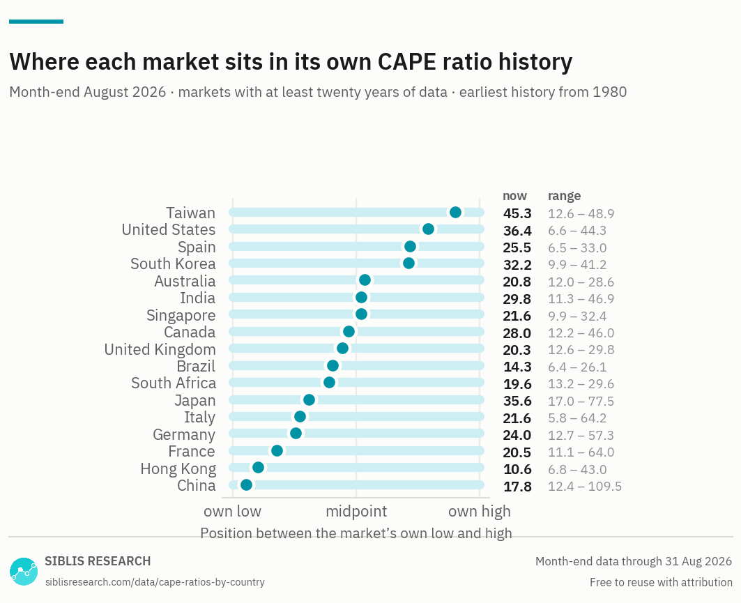
Position within a range is not necessarily the same as being cheap: a market can sit low in its own range because it once had a bubble. For example Chinese stock market is famous for its historical price bubbles.

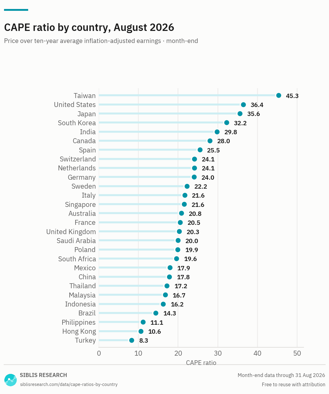
A ranking across markets is the number people ask for, and the weakest thing CAPE does. See "Why the ranking is the weakest use of CAPE" below.
| Period | United States | Japan | China | Germany | United Kingdom | France | India | Canada | Australia | Brazil |
|---|---|---|---|---|---|---|---|---|---|---|
| Sept 2026 | 35.9 | 35.4 | 17.1 | 22.9 | 19.6 | 19.5 | 28.7 | 27.1 | 20.1 | 14.9 |
| 2025 Dec | 34.7 | 29.4 | 17.7 | 24.1 | 20.2 | 21.2 | 35.1 | 26.2 | 21.0 | 14.6 |
| 2024 Dec | 32.4 | 26.1 | 15.0 | 21.1 | 18.2 | 20.5 | 34.1 | 21.8 | 20.6 | 12.6 |
| 2023 Dec | 28.3 | 24.9 | 13.2 | 19.3 | 18.3 | 23.4 | 34.9 | 19.5 | 19.9 | 16.3 |
| 2022 Dec | 24.8 | 22.0 | 13.7 | 17.5 | 19.3 | 22.9 | 32.4 | 19.5 | 20.4 | 16.2 |
| 2021 Dec | 34.8 | 28.7 | 16.6 | 23.4 | 20.4 | 27.9 | 34.8 | 23.7 | 23.8 | 18.6 |
| 2020 Dec | 30.4 | 30.3 | 16.5 | 21.9 | 17.1 | 21.1 | 29.9 | 20.3 | 20.6 | 23.0 |
| 2019 Dec | 27.6 | 27.2 | 14.7 | 21.3 | 18.8 | 22.3 | 27.5 | 20.4 | 20.7 | 21.8 |
| 2018 Dec | 23.8 | 26.5 | 12.9 | 18.7 | 18.3 | 18.7 | 25.9 | 17.9 | 18.3 | 16.6 |
| 2017 Dec | 27.0 | 32.8 | 18.1 | 24.6 | 20.7 | 20.9 | 25.3 | 20.5 | 19.4 | 14.0 |
| 2016 Dec | 23.3 | 28.6 | 18.0 | 22.4 | 18.0 | 18.2 | 20.2 | 19.6 | 17.5 | 10.6 |
| 2015 Dec | 22.0 | 28.9 | 22.3 | 21.3 | 14.7 | 16.2 | 20.2 | 16.5 | 15.6 | 7.4 |
| 2014 Dec | 23.2 | 27.9 | 22.3 | 20.4 | 14.9 | 14.0 | 22.5 | 18.9 | 15.8 | 9.1 |
| 2013 Dec | 21.6 | 28.4 | 16.3 | 21.7 | 15.8 | 14.1 | 19.0 | 18.2 | 15.8 | 9.8 |
| 2012 Dec | 17.8 | 20.2 | 20.1 | 19.8 | 14.7 | 12.9 | 20.0 | 17.5 | 14.3 | 12.5 |
| 2011 Dec | 16.8 | 17.3 | 22.4 | 17.4 | 15.7 | 12.5 | 18.6 | 18.2 | 13.0 | 13.1 |
| 2010 Dec | 17.9 | 22.1 | 33.3 | 22.1 | 18.9 | 15.8 | 27.5 | 21.9 | 16.0 | 18.0 |
| 2009 Dec | 16.2 | 24.1 | 45.4 | 20.1 | 18.3 | 16.7 | 27.0 | 20.1 | 16.9 | 20.3 |
| 2008 Dec | 13.3 | 20.3 | 28.6 | 15.9 | 14.4 | 13.1 | 19.0 | 16.6 | 13.5 | 12.3 |
| 2007 Dec | 22.3 | 40.1 | 94.4 | 29.9 | 22.6 | 25.0 | 46.9 | 28.5 | 26.2 | 24.2 |
| 2006 Dec | 23.7 | 51.2 | 55.8 | 29.4 | 24.0 | 28.4 | 34.2 | 29.7 | 27.0 | 19.5 |
The complete series — daily, and back to 1980 for the United States — is part of the Global Equity Valuations Database.
Closest to its own high
Biggest moves on a year
Spread, Sept 2026
Where markets stand, September 2026
Taiwan is the most expensive market on this measure at 46.7, and Turkey the least at 6.8 — a spread of 6.9 to one across 28 markets. The United States stands at 35.9.
Using CAPE to estimate global stock market valuations
The idea behind the CAPE ratio is that company earnings tend to be volatile and cyclical fluctuations have a huge impact on the traditional trailing 12-month P/E ratio. Instead of using annual earnings, CAPE ratio uses the average (inflation-adjusted) earnings of the last 10 years to smoothen out any regular cyclical variations.
Professor Shiller popularized the ratio when he demonstrated the clear historical relationship between the ratio and market returns when calculated for the S&P 500 index. Multiple studies have shown that Shiller PE can be successfully applied also to global markets.
For additional information about using CAPE on a global scale, check the writings by Meb Faber. Mr. Faber’s blog covers practically everything you need to know about the ratio.
Why the ranking is the weakest use of CAPE
Comparing one market's CAPE with another's is harder than it looks, for three main reasons.
Inflation histories differ. The measure restates ten years of earnings in current money. Two markets with very different inflation over that decade are not adjusting the same quantity, and the adjustment is larger where inflation was higher.
Growth rates differ. The gap between current earnings and the ten-year average is the growth delivered over that decade. A market that has grown quickly carries a structurally higher CAPE than a slow-growing one at the same price.
Index composition differs. A market heavy in banks and miners will read below one heavy in software whatever either is worth, and CAPE does nothing to correct for that.
The comparison the measure genuinely supports is a market against its own past, which is what the range chart shows. For a cross-market comparison on firmer ground, the sector EV/EBITDA page holds the sector constant.
Valuations vs. Market Liquidity: Which Matters More?
Traditionally, the relationship between market liquidity (the availability of money) and valuations has been clear-cut. Liquidity plays a crucial role in short-term price fluctuations and overall market stability, but in the long run, stock prices are expected to align with fundamental valuations. The core belief has always been that if valuations become excessively high compared to underlying fundamentals, a correction is inevitable.
But is this long-held assumption still valid?
In today’s financial landscape, central banks are actively navigating between quantitative easing (QE) and quantitative tightening (QT), injecting or withdrawing liquidity from markets at unprecedented scales. Could it be that liquidity itself has become a primary driver of stock prices—not just in the short term, but also in the long term?
Furthermore, stock prices influence corporate behavior. A high stock price can boost confidence, encourage risk-taking, and even shape executive decision-making, potentially driving future growth and earnings. In this context, does the stock price determine a company’s success, rather than merely reflecting it?
Additionally, the rise of passive investing—where capital flows indiscriminately into stocks based on index weightings rather than fundamentals—raises another question: Are traditional valuation metrics becoming obsolete? If money flows into stocks regardless of valuation, does comparing current multiples to historical levels even make sense anymore?
We are in the midst of a massive financial experiment, where governments and central banks play an increasingly dominant role in market dynamics. The question remains: Will the old rules of investing still hold in the future, or are we entering a new era where liquidity, rather than valuations, dictates stock prices indefinitely?
Reading the range chart
A market near its own high has been more expensive on this measure only rarely in twenty or more years. That is a statement about its own history and nothing else — it is not a forecast, and a market can stay near its own high for years.
Markets near the bottom of their range deserve the opposite caution. A very wide range usually means the market once had a bubble, and that a reading in the lower third looks cheap mainly by comparison with a peak nobody expects to see again.
Choosing a measure
No single ratio answers every question about a market. These pages cover the same countries — what changes is the question the measure is good at.
| Measure | The question it answers | Why that one |
|---|---|---|
| P/E ratios | What does a market cost on current and expected earnings? | The standard measure, and the only page here that carries forward estimates beside the trailing figure. |
| CAPE ratios this page | Is a market expensive against its own past? | Ten years of inflation-adjusted earnings in the denominator, so one bad year cannot move it. |
| Earnings growth | How fast are earnings actually growing? | The denominator behind every valuation multiple, indexed so that markets in different currencies can be compared. |
| Dividend yields | What does a market pay out? | Income rather than valuation, though it moves inversely with price and is read alongside the multiples. |
| Market cap to GNI (GDP) | How large is a market against its own economy? | Ignores earnings entirely. The widest-angle measure here, and the one least affected by accounting. |
Where this data is used
Some examples. Siblis valuation data appears in peer-reviewed journals, central bank publications and the financial press.
Four decades of history, in one file
This page publishes twenty year-ends and the current reading. The Global Equity Valuations Database is the whole series, for every market.
How this is calculated
Price divided by the average of the previous ten years of aggregate inflation-adjusted earnings for each market's index — the country-level cyclically adjusted price-earnings ratio.
- Earnings — Aggregate trailing twelve-month earnings of the index constituents, normalised: major purely accounting gains and losses are removed.
- Inflation adjustment — Each year's earnings are restated in current money before averaging.
- Coverage — Every market in the database with at least ten years of earnings history. Wider than the P/E page, which requires forward estimates.
- Index used — Each market's main index. Where an index name is licensed, a descriptive name is shown instead.
- Revisions — Figures are point-in-time. If a company later restates its results, the historic reading is left exactly as first published: the series reflects what was known at the time, not what is known now.
Cite this page
Siblis Research. (2026). CAPE Ratios by Country [Data set]. Retrieved 30 September 2026, from siblisresearch.com/data/cape-ratios-by-country/
@misc{siblis_cape_ratios_by_country,
  title={CAPE Ratios by Country}, author={{Siblis Research}},
  year={2026}, url={https://siblisresearch.com/data/cape-ratios-by-country/},
  urldate={2026-09-30}}
Charts on this page may be reproduced free of charge with attribution to Siblis Research and a link to this page.