
Market cap to GNI (GDP) ratios by country
Total stock market capitalisation as a share of national income for 25 economies, year-end, with twenty years of history. Often called the Buffett indicator, after the remark that it is "probably the best single measure of where valuations stand at any given moment".
The measure is widely called market cap to GDP; the ratio here uses gross national income. GNI is national output plus net income received from abroad, and it is the better denominator for this ratio — Buffett's original version of it, for the United States, was measured against national income rather than domestic product. GNI is close to GDP for most large economies and can differ materially for small open ones.
The measure ignores earnings entirely, which makes it immune to accounting and unreliable for comparing two markets with different listing patterns. Read the caution below before comparing countries.
| Market | Dec 2025 | Dec 2024 | Change |
|---|---|---|---|
| Taiwan | 325.0% | 276.7% | +48.3 |
| South Africa | 317.7% | 255.8% | +61.9 |
| Switzerland | 251.1% | 225.1% | +26.0 |
| United States | 223.7% | 213.0% | +10.7 |
| Canada | 199.2% | 160.2% | +39.0 |
| Japan | 177.6% | 153.4% | +24.2 |
| Singapore | 157.8% | 141.4% | +16.4 |
| South Korea | 144.6% | 88.3% | +56.3 |
| India | 134.0% | 135.6% | -1.6 |
| Australia | 113.2% | 108.0% | +5.2 |
| China | 101.7% | 82.6% | +19.1 |
| Malaysia | 100.8% | 107.7% | -6.9 |
| United Kingdom | 98.0% | 88.7% | +9.3 |
| Thailand | 87.1% | 98.4% | -11.3 |
| Chile | 74.9% | 55.6% | +19.2 |
| Indonesia | 69.6% | 57.2% | +12.4 |
| Spain | 65.4% | 49.5% | +16.0 |
| Germany | 53.6% | 47.6% | +6.0 |
| Italy | 51.9% | 40.7% | +11.2 |
| Greece | 45.4% | 37.7% | +7.7 |
| Philippines | 41.6% | 48.7% | -7.1 |
| Brazil | 39.2% | 35.8% | +3.4 |
| Austria | 35.6% | 25.6% | +10.0 |
| Mexico | 28.9% | 25.7% | +3.2 |
| Turkey | 28.3% | 30.2% | -1.8 |
Total market capitalisation of a country's listed companies divided by its gross national income for that year. Both figures are frozen once published: the year-end ratios above do not move when a statistical agency later revises its national income estimate.

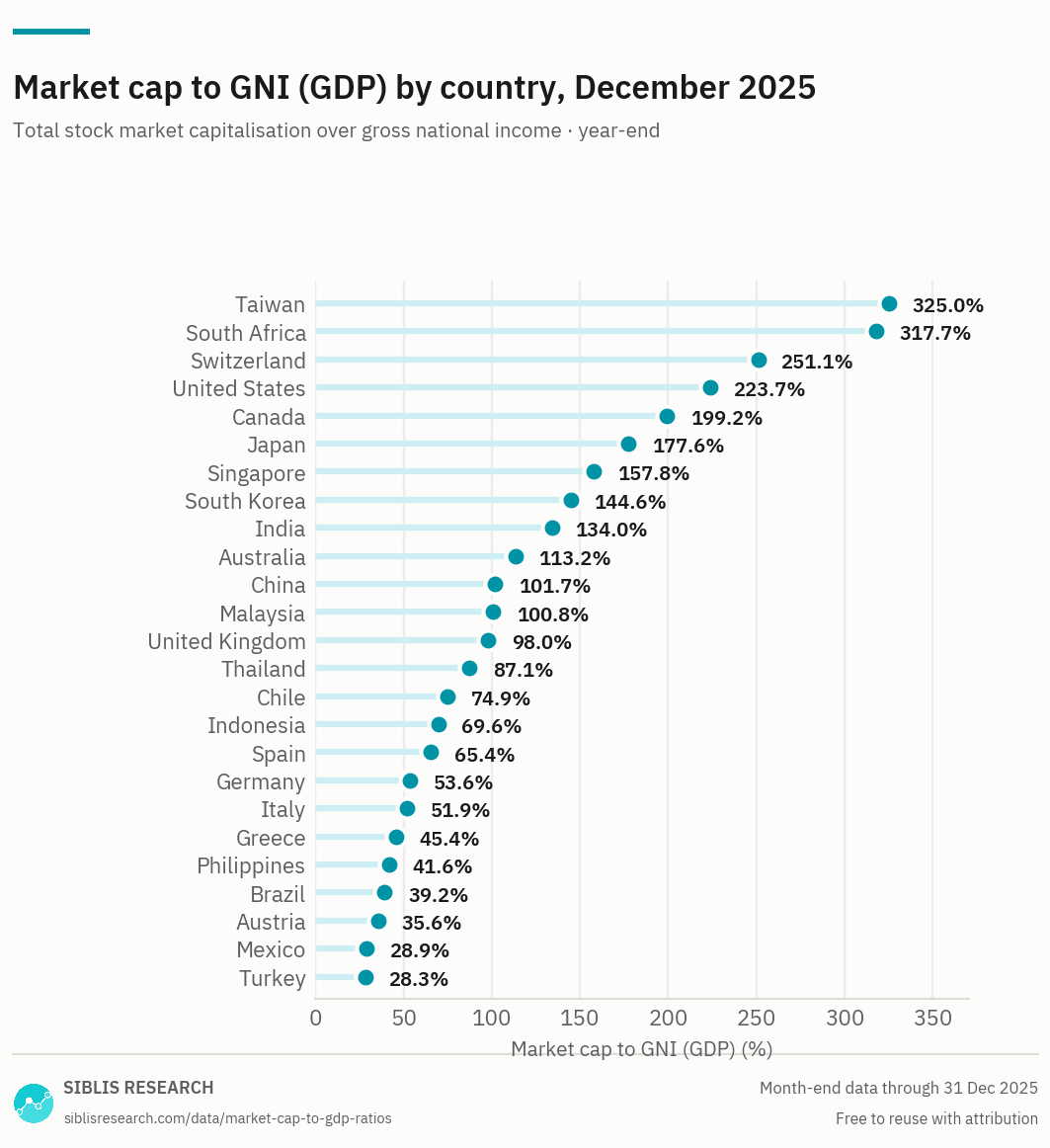
The ranking is driven as much by what is listed in a country as by what its market is worth. A small economy that hosts a few globally-earning companies will sit near the top whatever its valuation.
| Period | United States | Japan | China | Germany | United Kingdom | India | Canada | Australia | South Korea | Brazil |
|---|---|---|---|---|---|---|---|---|---|---|
| Dec 2025 | 223.7% | 177.6% | 101.7% | 53.6% | 98.0% | 134.0% | 199.2% | 113.2% | 144.6% | 39.2% |
| 2024 Dec | 213.0% | 153.4% | 82.6% | 47.6% | 88.7% | 135.6% | 160.2% | 108.0% | 88.3% | 35.8% |
| 2023 Dec | 177.9% | 139.8% | 75.6% | 46.0% | 89.3% | 124.7% | 143.6% | 106.9% | 111.8% | 45.6% |
| 2022 Dec | 155.4% | 118.8% | 82.4% | 43.8% | 98.3% | 105.4% | 133.9% | 109.7% | 94.5% | 42.9% |
| 2021 Dec | 221.2% | 134.5% | 97.1% | 59.0% | 119.2% | 112.4% | 168.0% | 125.7% | 126.4% | 59.8% |
| 2020 Dec | 189.6% | 127.0% | 105.2% | 53.2% | 109.6% | 86.2% | 138.9% | 114.0% | 123.3% | 67.7% |
| 2019 Dec | 156.7% | 117.9% | 81.7% | 53.3% | 112.4% | 77.1% | 139.2% | 115.9% | 91.7% | 69.5% |
| 2018 Dec | 146.1% | 105.5% | 62.0% | 45.0% | 102.0% | 76.9% | 116.0% | 97.8% | 89.1% | 52.5% |
| 2017 Dec | 160.2% | 122.1% | 87.1% | 56.2% | 119.7% | 87.8% | 139.7% | 112.4% | 108.3% | 49.2% |
| 2016 Dec | 144.2% | 104.5% | 89.5% | 51.0% | 115.4% | 70.2% | 134.0% | 108.3% | 92.1% | 40.2% |
| 2015 Dec | 136.2% | 115.4% | 95.9% | 51.9% | 114.5% | 70.7% | 111.8% | 100.9% | 92.1% | 33.8% |
| 2014 Dec | 147.8% | 103.4% | 77.7% | 48.2% | 117.5% | 78.5% | 124.8% | 102.1% | 89.1% | 41.3% |
| 2013 Dec | 140.6% | 95.9% | 59.3% | 48.8% | 126.1% | 62.2% | 120.3% | 102.8% | 90.5% | 47.4% |
| 2012 Dec | 112.5% | 61.4% | 62.1% | 40.0% | 110.9% | 69.3% | 113.9% | 92.4% | 90.7% | 54.0% |
| 2011 Dec | 99.0% | 52.6% | 61.4% | 32.9% | 113.9% | 60.4% | 112.1% | 86.4% | 85.6% | 53.3% |
| 2010 Dec | 114.3% | 62.7% | 90.0% | 40.5% | 127.0% | 93.7% | 132.3% | 113.9% | 97.8% | 67.1% |
| 2009 Dec | 104.0% | 63.6% | 97.3% | 35.8% | 118.5% | 91.5% | 114.2% | 115.5% | 84.6% | 73.4% |
| 2008 Dec | 77.5% | 54.7% | 55.1% | 30.8% | 86.0% | 54.1% | 77.5% | 85.8% | 56.4% | 46.4% |
| 2007 Dec | 134.8% | 91.2% | 163.7% | 56.5% | 133.0% | 138.1% | 139.9% | 142.5% | 101.0% | 93.5% |
| 2006 Dec | 136.4% | 105.5% | 72.2% | 51.0% | 139.9% | 82.7% | 135.3% | 145.0% | 80.6% | 65.6% |
| 2005 Dec | 127.9% | 104.7% | 35.6% | 43.9% | 133.6% | 65.6% | 125.3% | 123.5% | 79.5% | 53.1% |
Twenty year-ends are published free. The full series is available to subscribers.
Biggest moves on a year
Spread, Dec 2025
Where the ratio stands, December 2025
Taiwan has the highest ratio at 325.0% and Turkey the lowest at 28.3%. The United States stands at 223.7%.
The one thing to understand before comparing countries
The numerator counts companies listed in a country. The denominator counts income earned in that country. For most economies those two overlap enough for the ratio to mean something. For several they do not, and the mismatch is the single largest driver of the ranking.
A small economy that happens to host a handful of companies selling to the whole world will show an enormous ratio — not because its market is expensive, but because its listed companies' value was never a claim on its domestic economy in the first place. The same logic runs in reverse in economies where large parts of business activity are unlisted, state-owned or family-held: the ratio understates them permanently, and has nothing to do with valuation.
So the ranking is not a league table of expensive to cheap. A country's ratio compared with its own history carries far more information than the same ratio compared with another country's.
What it is good for
Two things.
The first is the long domestic time series. Within one country, listing patterns change slowly, so the ratio's movement over decades is close to a clean signal about how the market has grown relative to the economy underneath it. That is the use the measure was originally put to, and it is why the history table matters more here than on most pages.
The second is as a cross-check on the earnings-based measures. Every P/E and CAPE ratio shares a denominator family — reported earnings, with all the accounting choices that involves. This one does not touch earnings at all, so when it disagrees with them, the disagreement is worth following up.
The denominator is fixed once calculated
The national income figure used for each year is fixed at the point of calculation. Statistical agencies revise their estimates for years afterwards; those revisions are not applied backwards. A ratio for 2015 is the ratio as it was calculable in 2015.
That choice matters more than it sounds. If revisions were applied backwards, every year in the history would move every time an agency restated its national accounts, and a series that keeps moving underneath you cannot be compared with itself.
Choosing a measure
No single ratio answers every question about a market. These pages cover the same countries — what changes is the question the measure is good at.
| Measure | The question it answers | Why that one |
|---|---|---|
| P/E ratios | What does a market cost on current and expected earnings? | The standard measure, and the only page here that carries forward estimates beside the trailing figure. |
| CAPE ratios | Is a market expensive against its own past? | Ten years of inflation-adjusted earnings in the denominator, so one bad year cannot move it. |
| Earnings growth | How fast are earnings actually growing? | The denominator behind every valuation multiple, indexed so that markets in different currencies can be compared. |
| Dividend yields | What does a market pay out? | Income rather than valuation, though it moves inversely with price and is read alongside the multiples. |
| Market cap to GNI (GDP) this page | How large is a market against its own economy? | Ignores earnings entirely. The widest-angle measure here, and the one least affected by accounting. |
Where this data is used
Some examples. Siblis valuation data appears in peer-reviewed journals, central bank publications and the financial press.
The whole database, every trading day
This page publishes one reading a year. The Global Equity Valuations Database is the valuation dataset behind the rest of this site.
How this is calculated
Total market capitalisation of a country's listed companies at year-end, divided by its gross national income for that year.
- Market capitalisation — Domestic listed companies, at year-end.
- National income — Gross national income: national output plus net income from abroad. GNI, not GDP, is the appropriate denominator for this ratio, and is the measure Buffett's original U.S. version used. The ratio is commonly called market cap to GDP, which is why that name is kept in the title and the address.
- Coverage — Economies with both series available. Countries are added as the underlying national income data allows.
- Revisions — Figures are point-in-time, on both sides of the ratio. National income for a given year is fixed at the point of calculation and is not restated when a statistical agency revises its estimate afterwards.
Cite this page
Siblis Research. (2025). Market Cap to GDP Ratio by Country [Data set]. Retrieved 31 December 2025, from siblisresearch.com/data/market-cap-to-gdp-ratios/
@misc{siblis_market_cap_to_gdp_ratios,
  title={Market Cap to GDP Ratio by Country}, author={{Siblis Research}},
  year={2025}, url={https://siblisresearch.com/data/market-cap-to-gdp-ratios/},
  urldate={2025-12-31}}
Charts on this page may be reproduced free of charge with attribution to Siblis Research and a link to this page.