
World stock market CAPE ratio
The CAPE ratio of the global equity market stands at 29.05 at 30 September 2026, against a median of 21.59 across the 561 months the series has run — 35% above it. This has been calculated using an index of the 3,000 largest public companies in both developed and emerging markets, including the United States.
CAPE divides price by ten years of inflation-adjusted aggregate earnings. One year of profits tells you what a market earned in one point of the cycle; ten years of them tell you what it earns through a cycle, which is the comparison this page is built around.

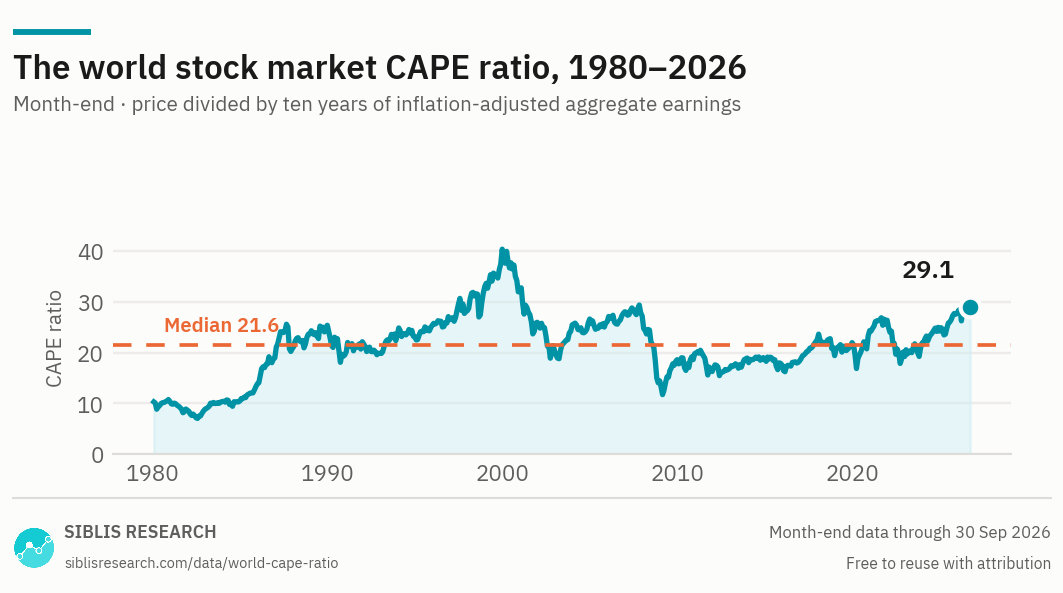
Forty-six years of month-end readings. The dashed line is the median of the whole series.
| Decade | Average | Low | High | At the end |
|---|---|---|---|---|
| 1980s | 14.6 | 7.0 (Jul 1982) | 25.6 (Aug 1987) | 25.4 |
| 1990s | 25.3 | 18.1 (Sept 1990) | 40.4 (Dec 1999) | 40.4 |
| 2000s | 25.0 | 11.7 (Feb 2009) | 40.0 (Mar 2000) | 18.6 |
| 2010s | 18.9 | 15.5 (May 2012) | 23.6 (Jan 2018) | 22.0 |
| 2020s to date | 23.6 | 16.9 (Mar 2020) | 29.7 (Aug 2026) | 29.1 |
Month-end readings, grouped by decade. Average is the mean of every month in the decade; low and high are the lowest and highest month-end readings in it. Free to reuse with attribution.

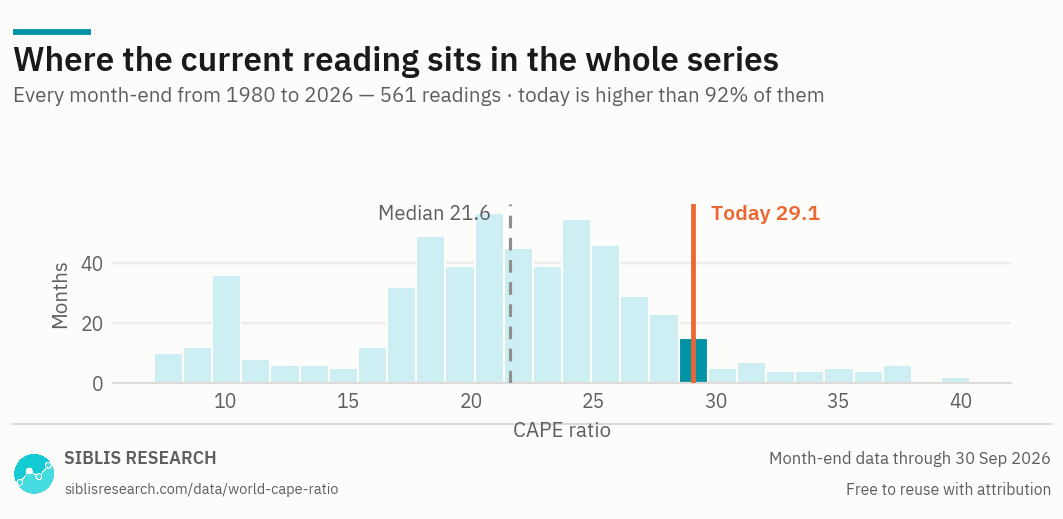
Every month-end since 1980, counted into bands. The current reading is higher than 92% of them.
This reading
The whole series
Where the reading sits
At 29.05, the world CAPE is higher than 92% of the 561 month-end readings since 1980. Only 44 months in the entire series have been more expensive — and every one of them falls between June 1997 and August 2026.
That is the whole finding, and it is worth stating plainly: the only period in forty-six years when world equities carried a higher multiple of their decade of earnings was the run into the 2000 peak. The series high is 40.39, in December 1999. The low is 7.05, in July 1982.
Why ten years of earnings
A trailing P/E uses one year of profits, which is the most recent year — and the most recent year is wherever the cycle happens to be. At the bottom of a recession, earnings collapse, the denominator shrinks and the multiple spikes: a market can look most expensive at precisely the moment it is cheapest. At the top of a boom, peak margins flatter the denominator and the same market looks reasonable.
Averaging a decade of earnings, adjusted for inflation so that older profits are counted in today's money, removes most of that. What is left moves with price rather than with the business cycle, which is what makes a reading comparable with a reading from twenty years ago.
The cost is responsiveness. CAPE is slow on purpose: a genuine, permanent improvement in what a market earns takes ten years to work fully into the denominator, and until it does, the ratio will read expensive. Anyone using it has to decide whether a high reading is a valuation signal or a composition change that the denominator has not caught up with yet.
The world reading is not the American one
The world figure is dominated by whichever markets are largest, and the United States is by far the largest. That does not make the world CAPE redundant — it makes it the weighted answer to a different question: what global equity costs, in proportion to how much of it there is.
If the question is instead whether one market is expensive, the aggregate is the wrong instrument. Every market has its own composition, its own accounting and its own record, and a reading only means something read against that record. Those are on CAPE ratios by country.
What a high reading does and does not tell you
The empirical case for CAPE is about long horizons. Across long samples, a high starting CAPE has been associated with lower average real returns over the following decade, and a low one with higher returns. The relationship is real, it is noisy, and it says nothing useful about the next twelve months. A market can stay expensive for years, and an expensive market that keeps getting more expensive is the most common way the ratio embarrasses people who trade on it.
Three cautions, all of which apply to the reading on this page:
- Composition drifts. The sector mix of the world index in 1985 is not the mix today, and a market whose weight has shifted towards businesses that need little capital will support a higher multiple for reasons that have nothing to do with sentiment.
- The denominator carries ten years of accounting. Write-off practice, the treatment of intangibles, and the accounting standards in force all changed over the period this series covers. Normalising the earnings removes some of that, not all of it.
- The reference period is the argument. A reading in the top decile of a forty-six-year distribution is a much stronger claim than one in the top decile of a fifteen-year distribution. The decade table above is there so that the reference period is visible rather than assumed.
Against the other measures
CAPE answers is this market expensive against its own history. It is poor at anything else. For what the market costs against current profits and what those profits are doing, the world market sits on global stock market P/E with its trailing and forward multiples side by side. For the same measure across individual markets, see CAPE ratios by country, and for the eleven sectors, CAPE ratios by sector.
Forty-six years of the world CAPE, month by month
This page publishes the decade summary and the current readings. The Global Equity Valuations Database carries every month of the series, and every trading day of the recent history.
How the CAPE ratio is calculated
Price divided by the ten-year average of inflation-adjusted aggregate earnings, calculated on the aggregate rather than as an average of constituents' own ratios.
- Numerator — The aggregate market capitalisation of the index, deflated by consumer price inflation to the date of the reading.
- Denominator — Aggregate normalised net income for each of the preceding ten years, each year deflated to the same date, then averaged. Normalisation removes non-recurring items: impairments, restructuring and litigation charges, M&A costs, and gains or losses on discontinued operations.
- Deflator — The consumer price index of the relevant country. For the global aggregates, U.S. CPI is used as the common deflator so that the regional series stay comparable.
- Coverage — The world aggregate begins in 1980. A market enters the world series once it has ten years of earnings behind it, so its own start date and the world series' start date differ.
- Revisions — Figures are point-in-time. A historic reading is left as first published when a company later restates its results.
Where this data is used
Some examples. Siblis valuation data appears in peer-reviewed journals, central bank publications and the financial press.