
P/E ratios and earnings growth by sector
The table below provides trailing and forward price-to-earnings ratios for the eleven Sectors, including historical earnings growth, calculated separately for the United States, for global markets, and for global markets excluding the United States. Both global measures cover developed and emerging markets, and the global index includes the United States.
A sector multiple is only interpretable next to its denominator. The same P/E ratio means something different for a sector whose earnings are compounding at 20% a year and one whose earnings are falling, and the two sit side by side here for that reason. To compare a sector across markets use EV/EBITDA; to compare a sector with its own history use CAPE.
| Valuation | Earnings growth | |||||
|---|---|---|---|---|---|---|
| Sector | Trailing P/E | Forward P/E | Implied | 1 year | 3 yr p.a. | 5 yr p.a. |
| Real EstateP/E is a poor measure here — see note | 39.82 | 33.34 | +19.4% | −0.8% | +0.2% | +1.4% |
| Information Technology | 38.50 | 21.15 | +82.0% | +44.0% | +28.7% | +18.2% |
| Industrials | 28.72 | 22.61 | +27.0% | +11.2% | +1.7% | +17.4% |
| Health Care | 24.56 | 18.33 | +34.0% | +5.2% | +3.7% | +3.7% |
| Consumer Discretionary | 23.33 | 22.66 | +3.0% | +29.4% | +20.4% | +13.1% |
| Consumer Staples | 22.86 | 20.80 | +9.9% | +4.5% | +3.6% | +3.2% |
| Materials | 22.73 | 16.54 | +37.4% | +24.4% | −0.5% | +2.9% |
| Communication Services | 18.14 | 18.79 | −3.5% | +41.8% | +35.6% | +20.4% |
| Energy | 17.82 | 13.24 | +34.6% | +29.6% | −10.3% | n/a |
| Utilities | 17.66 | 15.46 | +14.2% | +11.9% | +10.3% | +6.9% |
| Financials | 15.67 | 14.01 | +11.8% | +17.7% | +9.0% | 0.0% |
Implied is the earnings growth the market has already priced in: trailing P/E divided by forward P/E, minus one. Earnings growth is the compound annual change in aggregate sector earnings, nominal and in U.S. dollars. A growth figure reads n/a where earnings at the start of the period were negative, because a rate measured from a negative base is arithmetic without meaning.

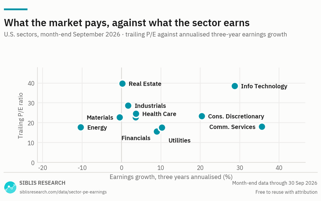
Sectors above the line of their peers are paying up for growth they have already delivered; sectors to the left of the axis have shrinking earnings whatever their multiple says. Real Estate sits at the top left of the chart for reasons that have little to do with how expensive it is — see below.

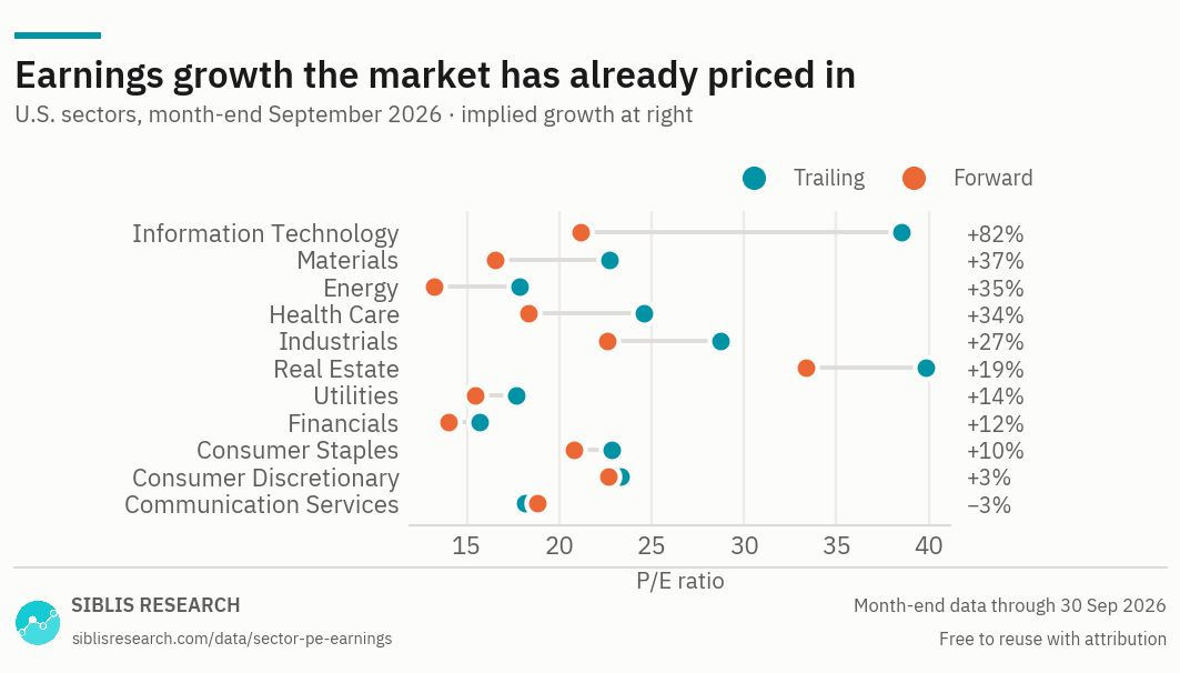
The distance between the two dots is the earnings growth analysts expect over the coming twelve months. It is an expectation with no track record attached, and it is the part of a forward P/E that does the work.
| Sector | United States | Global | Global ex-U.S. |
|---|---|---|---|
| Real Estate | 39.82 | 23.10 | 14.17 |
| Information Technology | 38.50 | 33.13 | 22.82 |
| Industrials | 28.72 | 24.84 | 21.72 |
| Health Care | 24.56 | 21.95 | 17.39 |
| Consumer Discretionary | 23.33 | 20.60 | 16.52 |
| Consumer Staples | 22.86 | 20.51 | 17.66 |
| Materials | 22.73 | 18.31 | 16.79 |
| Communication Services | 18.14 | 17.88 | 16.89 |
| Energy | 17.82 | 14.28 | 11.35 |
| Utilities | 17.66 | 16.42 | 15.24 |
| Financials | 15.67 | 12.64 | 10.95 |
The Financials row deserves particular care, and the Real Estate row is not really a valuation measure at all. Both are covered in the analysis below.

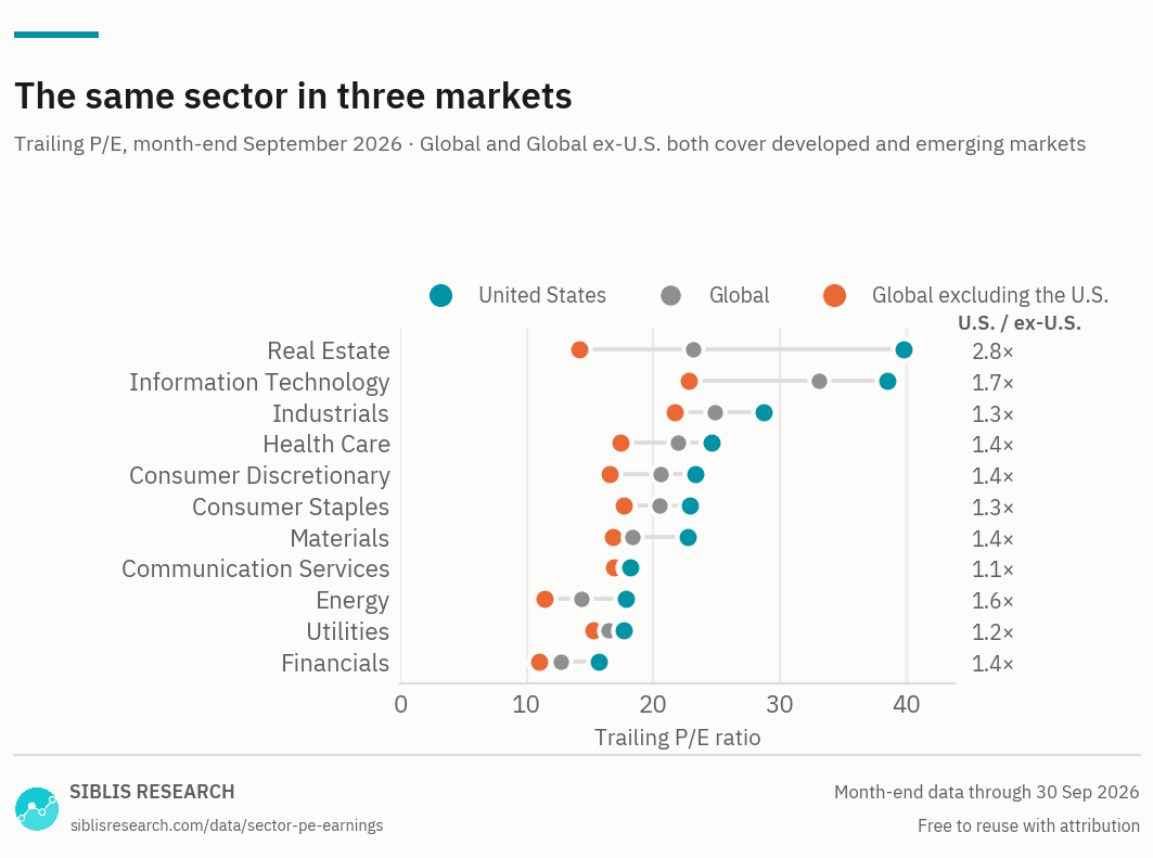
11 of the 11 sectors trade higher in the United States, by very different margins. The two widest gaps are the two the table cannot explain on its own: Real Estate, where the U.S. ratio is not a valuation measure, and Financials, where the ex-U.S. figure is held down by one group of constituents. Both are covered below.
| Month | Real Estate | Information Technology | Industrials | Health Care | Consumer Discretionary | Consumer Staples | Materials | Communication Services | Energy | Utilities | Financials |
|---|---|---|---|---|---|---|---|---|---|---|---|
| Sept 2026 | 39.82 | 38.50 | 28.72 | 24.56 | 23.33 | 22.86 | 22.73 | 18.14 | 17.82 | 17.66 | 15.67 |
| 2025 Dec | 38.41 | 39.91 | 28.63 | 23.08 | 32.98 | 23.08 | 25.83 | 22.96 | 17.27 | 21.29 | 18.47 |
| 2024 Dec | 38.48 | 41.53 | 24.44 | 23.71 | 32.99 | 21.36 | 25.48 | 23.23 | 13.53 | 18.78 | 16.75 |
| 2023 Dec | 39.25 | 36.68 | 20.42 | 23.16 | 28.95 | 20.17 | 20.48 | 21.71 | 10.07 | 18.47 | 14.68 |
| 2022 Dec | 26.99 | 23.04 | 22.42 | 20.19 | 25.66 | 23.65 | 14.41 | 14.59 | 8.79 | 22.95 | 14.84 |
| 2021 Dec | 45.48 | 34.24 | 33.89 | 22.55 | 39.62 | 23.90 | 20.54 | 23.59 | 41.90 | 22.66 | 11.38 |
| 2020 Dec | 39.63 | 35.06 | 42.28 | 23.01 | 44.68 | 21.56 | 30.58 | 29.16 | Negative | 21.24 | 16.42 |
| 2019 Dec | 33.80 | 25.76 | 19.06 | 21.74 | 24.99 | 21.66 | 22.21 | 21.47 | 19.85 | 21.67 | 14.22 |
| 2018 Dec | 30.44 | 17.04 | 14.88 | 20.39 | 19.63 | 17.76 | 15.12 | 15.59 | 18.09 | 16.75 | 13.10 |
| 2017 Dec | 33.09 | 23.82 | 21.78 | 21.78 | 22.77 | 21.92 | 22.57 | 22.35 | 54.26 | 19.03 | 19.97 |
| 2016 Dec | 26.49 | 22.00 | 19.69 | 19.21 | 19.52 | 21.59 | 27.70 | 22.14 | Negative | 18.39 | 18.69 |
Historical data for the global and global ex-U.S. sectors is available to subscribers.
Earnings growth, three years
Growth priced in
Where sector multiples stand, September 2026
In the United States, Communication Services has grown earnings fastest over three years at +35.6% a year and Energy slowest at −10.3%. The widest gap between the trailing and forward multiple is Information Technology, where the market has already priced in +82.0% growth over the coming year.
On the multiples themselves, Information Technology is the most expensive sector at 38.50 and Financials the least at 15.67. Real Estate is left out of that comparison: it carries a higher ratio than either, and for reasons that have nothing to do with being expensive.
Why the U.S. Real Estate P/E is so high, and why you should ignore it
Real Estate carries the highest trailing P/E of the eleven U.S. sectors, at 39.82, on earnings that have grown +0.2% a year over three years. At face value that is an expensive sector with no growth. It is neither: the ratio is close to meaningless for property companies, for three separate reasons.
The accounting. Depreciation on buildings is one of the largest expense lines a property company reports, and it is entirely non-cash: the building is written down over decades on the income statement while, in most markets and most decades, the asset itself holds or gains value. The denominator of this ratio is therefore a number the industry does not use. Property companies report funds from operations — net income with depreciation added back and property sale gains removed — and price to FFO is a far lower and far more comparable figure.
The legal structure. Most large U.S. property companies are real estate investment trusts, which pay no corporate income tax provided they distribute at least 90% of taxable income. A REIT therefore retains almost nothing, funds growth by issuing equity and debt rather than from profit, and reports an income figure built to satisfy a distribution test.
The operations. Net income is what remains of a large asset base after interest on a large debt load — a small residual of two big numbers, so a modest move in rents, occupancy or borrowing costs swings it by a large percentage. Lumpy gains on property sales run through it as well: a sector can post a strong earnings year because several buildings happened to be sold.
What to use instead. Price to book, for a sector whose value genuinely sits on the balance sheet. EV/EBITDA, which is measured above both depreciation and debt. Dividend yield, which is more informative here than elsewhere because the distribution requirement makes the payout a feature rather than a policy choice.
Why global ex-U.S. Financials looks cheaper than it is
The Financials row shows 15.67 in the United States against 10.95 outside it, and the gap is much wider than for any neighbouring sector. Most of that difference is not a judgement about non-U.S. banks in general.
Mainland Chinese banks trade at very low multiples — low single figures for the largest of them for much of the past decade — and they are a substantial weight in the global ex-U.S. Financials index. Because this ratio is an aggregate, total market capitalisation over total earnings rather than an average of the constituents' multiples, a large block of companies on very low multiples pulls the whole figure down in proportion to its size.
The consequence is practical. The global ex-U.S. Financials multiple is not a reading on European or Japanese banks, and using it as one materially overstates how cheap they are. Anyone comparing banking systems needs the constituent markets rather than the aggregate, and the country pages are where those sit.
Sectors cannot be ranked against each other on P/E
The ranking in the first table is the number people ask for and the weakest thing the measure does. Three sectors can carry identical multiples and be nothing alike.
Growth rates differ permanently. A sector compounding earnings at 20% a year deserves a higher multiple than one growing at 3%, and will carry one in every market and every decade. The scatter chart above is on the page for exactly this reason: a multiple and a growth rate read together say something a ranking cannot.
Cyclicality differs. Energy, Materials and Financials earn most in the good years, and their P/E ratios are lowest at the top of the cycle and highest at the bottom — the inverse of what the ratio appears to say. This is the standard trap in cyclical sectors, and it is why CAPE exists.
Accounting differs. Real Estate is the extreme case above, but it is a difference of degree rather than kind. Sectors with heavy intangible investment expense most of it as it is incurred, which depresses current earnings and raises the multiple; sectors with heavy physical investment capitalise it and depreciate it slowly.
The forward multiples
The gap between the trailing and forward P/E is the earnings growth analysts have priced in, and on a sector basis it is often very large. Information Technology at 38.50 trailing against its forward multiple implies +82.0% earnings growth over the coming twelve months.
Two cautions. Forward estimates are expectations rather than forecasts with a measured track record, and in aggregate they have a documented optimistic bias. And a sector's forward figure is dominated by its largest constituents, so an implied growth rate for a concentrated sector is largely a statement about a handful of companies.
Choosing a measure
No single ratio answers every question about a sector. Each of these pages covers the same eleven sectors — what changes is the question the measure is good at, and how far the coverage reaches.
| Measure | The question it answers | Why that one |
|---|---|---|
| EV/EBITDA | How does one sector compare across markets? | Sits above tax and debt, so it survives crossing borders. The only measure here that makes an international sector comparison sound. |
| P/E and earnings this page | How fast are a sector’s earnings growing? | Trailing and forward multiples with the earnings behind them, so the multiple and its denominator can be read together. |
| CAPE | Is a sector expensive against its own history? | Averages a decade of real earnings, which smooths the cycle out of the denominator. |
| Price to book | What is the market paying for the assets? | Works where earnings-based measures break down — asset-heavy sectors, and banks in particular. U.S. sectors only. |
| Dividend yield | Which sectors pay, and how much? | Income rather than valuation, but it moves inversely with price and is read alongside the multiples. U.S. sectors only. |
Where this data is used
Some examples. Siblis valuation data appears in peer-reviewed journals, central bank publications and the financial press.
The earnings behind every sector multiple
The free tables carry a current reading for all three markets and ten year-ends for the United States. The rest of the history is the subscription.
How this is calculated
Aggregate market capitalisation of a sector's constituent companies divided by their aggregate earnings — not an average of the constituents' individual multiples.
- Trailing P/E — Aggregate normalised net income over the previous twelve months. Major purely accounting gains and losses are removed.
- Forward P/E — Consensus estimates for the next twelve months, aggregated the same way.
- Earnings growth — Compound annual change in aggregate sector earnings, nominal, in U.S. dollars. Shown as n/a where the starting value was negative.
- Negative earnings — Where a sector's aggregate earnings are negative the P/E ratio is shown as Negative rather than as a number, because a negative multiple cannot be read as a valuation.
- Coverage — Eleven sectors for the United States, global and global ex-U.S. markets.
- Revisions — Figures are point-in-time. If a company later restates its results, the historic reading is left exactly as first published: the series reflects what was known at the time, not what is known now.
Cite this page
Siblis Research. (2026). P/E Ratios & Earnings by Sector [Data set]. Retrieved 30 September 2026, from siblisresearch.com/data/sector-pe-earnings/
@misc{siblis_sector_pe_earnings,
  title={P/E Ratios & Earnings by Sector}, author={{Siblis Research}},
  year={2026}, url={https://siblisresearch.com/data/sector-pe-earnings/},
  urldate={2026-09-30}}
Charts on this page may be reproduced free of charge with attribution to Siblis Research and a link to this page.