
Corporate earnings growth by country
Index-level earnings growth for 28 stock markets over one, three and five years, and the split of each market's price move between earnings and re-rating.
Every figure here is nominal, in each market's own reporting currency, and is not adjusted for inflation. A market with high domestic inflation will show high nominal earnings growth while its companies earn nothing more in real terms, and a market whose currency has weakened will look better at home than it does to an outside investor. For serious analysis, subscribe and get access the the underlying earnings data. Then choose your preferred inflation metric to adjust the earnings.
For the multiples these earnings sit underneath, see P/E ratios by country and CAPE ratios.
| Market | Index used | 1 year | 3 years p.a. | 5 years p.a. |
|---|---|---|---|---|
| Turkey | BIST 100 Index | +70.9% | +1.6% | +43.8% |
| Poland | WIG Index | +31.6% | +8.9% | +24.1% |
| South Korea | KOSPI Index | +114.2% | +55.6% | +23.1% |
| Spain | IBEX 35 Index | +2.6% | +11.3% | +21.1% |
| Netherlands | AEX Index | +20.8% | +7.5% | +18.5% |
| Italy | FTSE MIB Index | −1.1% | −8.6% | +17.3% |
| Singapore | STI Index | +9.7% | +4.3% | +17.0% |
| Philippines | PSEi Index | +11.7% | +8.9% | +16.0% |
| Japan | Nikkei 225 Index | +40.9% | +20.6% | +15.3% |
| Indonesia | Jakarta Stock Exchange Composite Index | +10.6% | +5.5% | +14.8% |
| United States | U.S. Large Cap | +12.6% | +10.3% | +12.2% |
| United Kingdom | FTSE 100 Index | +8.4% | +1.9% | +11.7% |
| Sweden | OMX Stockholm 30 Index | +59.6% | +19.8% | +11.2% |
| India | NIFTY 50 Index | +2.6% | +7.5% | +11.1% |
| France | CAC 40 Index | +4.6% | −6.3% | +10.5% |
| Canada | Canada Large Cap | +21.1% | +6.7% | +9.9% |
| Taiwan | TWSE Index | +44.8% | +22.3% | +9.5% |
| Mexico | Mexico Large Cap | +12.8% | +5.9% | +9.5% |
| South Africa | FTSE/JSE Africa All Shares Index | +20.6% | +9.9% | +8.7% |
| Saudi Arabia | Tadawul Index | +2.7% | +1.6% | +8.1% |
| Germany | DAX 40 Index | +21.7% | +4.7% | +8.0% |
| Australia | Australia Large Cap | +6.2% | −3.1% | +7.4% |
| Brazil | Bovespa Index (Ibovespa) | +10.1% | +1.0% | +5.1% |
| Thailand | SET Index | +27.0% | +11.4% | +3.8% |
| Malaysia | FTSE Bursa Malaysia KLCI Index | +7.7% | +8.5% | +1.8% |
| China | SSE Composite Index | +5.3% | −1.0% | −0.3% |
| Hong Kong | Hang Seng Index | −1.3% | +5.6% | −3.5% |
| Switzerland | SMI Index | +5.1% | −0.8% | −7.1% |
Aggregate index earnings, compounded between month-ends. Nominal, local currency, before inflation. The index used for each market is shown, because an earnings growth rate belongs to a specific set of companies rather than to a country.

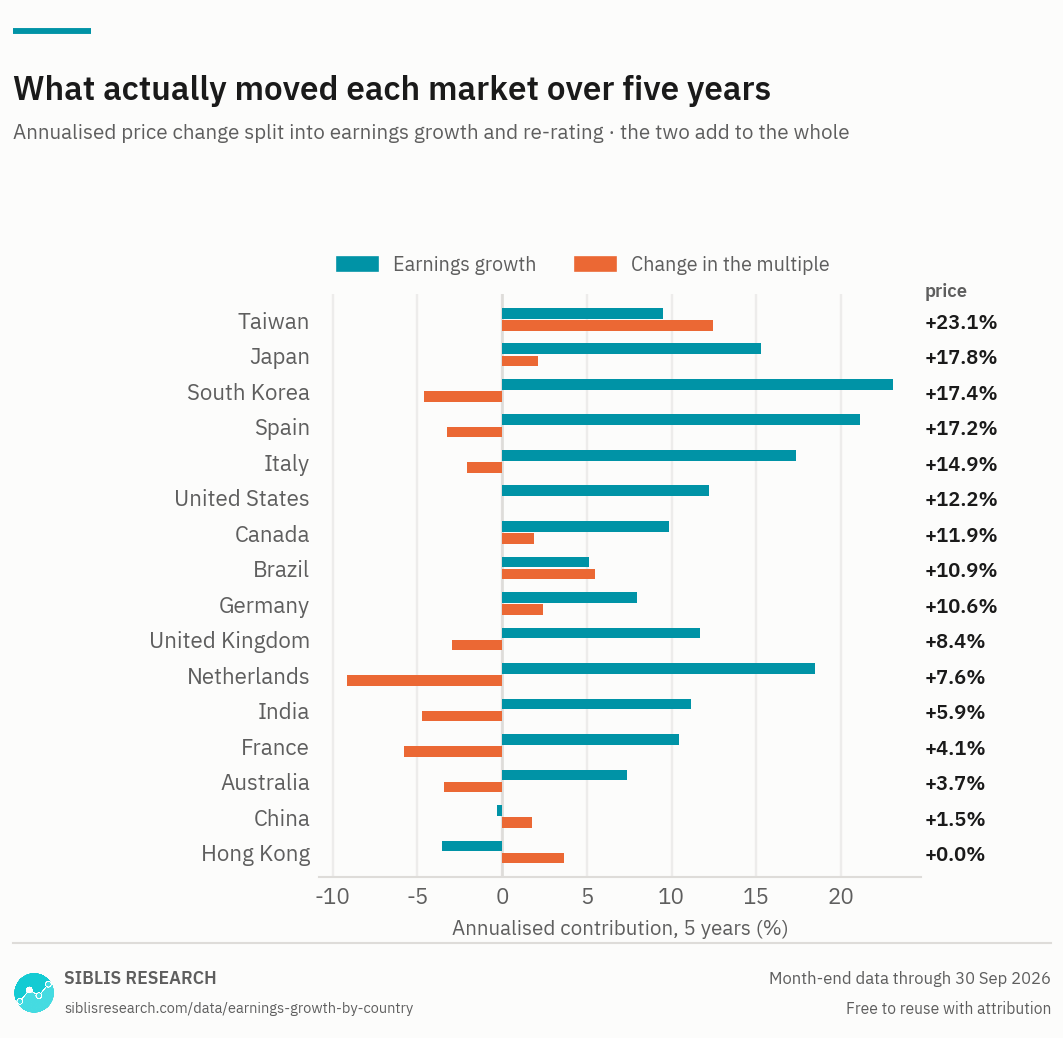
Price change equals earnings growth plus the change in the multiple, and the chart is log-additive so the two bars sum to the figure on the right. A market can rise strongly while getting cheaper, and several here did.

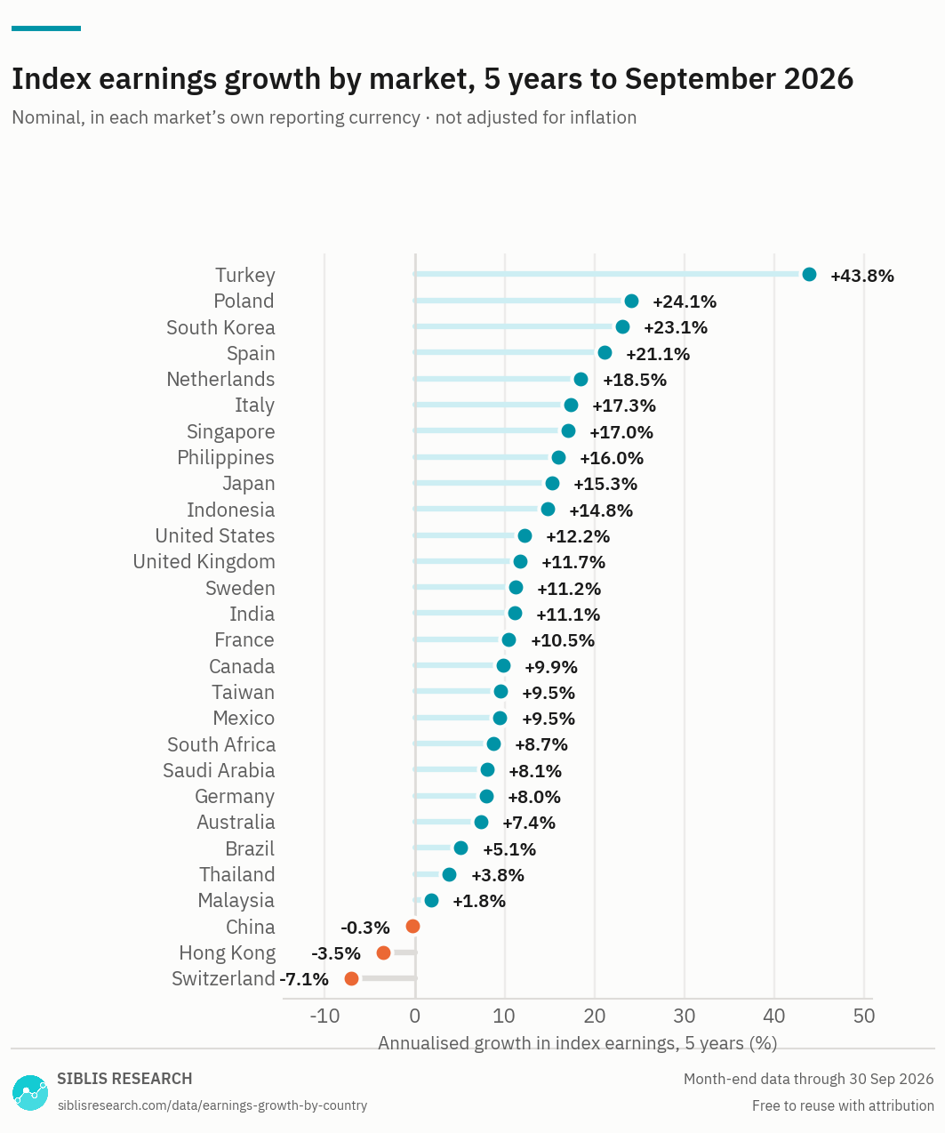
Nominal growth in local currency. The readings at the top of this chart belong to markets with high domestic inflation or a depressed starting point, not necessarily to the fastest-growing businesses.
Large markets, five years
Large markets, past year
The large markets, five years to September 2026
Among the major markets, South Korea has compounded index earnings fastest over five years at +23.1% a year, and Switzerland slowest at −7.1%. The United States managed +12.2%.
The United States is not the fastest of them, and that is the point worth making about it. Its +12.2% over five years, +10.3% over three and +12.6% over the past year describe a market whose earnings have grown at much the same rate throughout — no rebound, no stall. Very few large markets show that.
Where the recent acceleration is
The past year has been dominated by the semiconductor complex. South Korea compounded at +55.6% a year over three years and +114.2% over the last twelve months; Taiwan at +22.3% and +44.8%; Japan at +20.6% and +40.9%. Three markets, one cycle, and it is visible in the one-year column before anywhere else.
This is worth separating from the five-year figures. A memory cycle turning is not the same thing as five years of steady compounding, and the two get confused when only one horizon is shown. The three columns are there so the difference is visible.
Europe has gone sideways for three years
Several large European markets show respectable five-year growth and much weaker three-year growth: France at +10.5% over five years against −6.3% over three, Italy at +17.3% against −8.6%, Germany at +8.0% against +4.7%.
The five-year figure is measured from the depressed base of 2021 and captures the recovery out of it. The three-year figure covers the period since, and it is the more useful of the two for anyone asking what European earnings are doing now.
China is the exception
China is the large market where earnings have fallen on every horizon: −0.3% over five years, −1.0% over three and +5.3% over the past year. Hong Kong shows the same pattern.
That matters for how the Chinese multiple should be read. A P/E ratio whose denominator has been flat or falling for years carries very little information about the businesses underneath it: it moves when the price moves, and almost nothing else.
Why the decomposition chart is the better one
A market's price change splits into two parts — the growth in its earnings and the change in what investors will pay for them. In logs the two add exactly to the whole, which is what the chart above shows.
It answers a question the table cannot. Two markets can post the same price return, one because its companies earned more and one because the same earnings were re-rated upward, and those are entirely different propositions. Several markets in the chart rose strongly while their multiples fell: the profits more than paid for the de-rating.
The starting point does a lot of the work
An annualised growth rate depends entirely on where the period starts. A market whose earnings were depressed five years ago — by a recession, a commodity trough or a currency crisis — shows a strong rate that measures the recovery rather than the trend.
The markets to take seriously are the ones whose one-year, three-year and five-year figures agree. Where they disagree sharply, the disagreement is the finding.
Choosing a measure
No single ratio answers every question about a market. These pages cover the same countries — what changes is the question the measure is good at.
| Measure | The question it answers | Why that one |
|---|---|---|
| P/E ratios | What does a market cost on current and expected earnings? | The standard measure, and the only page here that carries forward estimates beside the trailing figure. |
| CAPE ratios | Is a market expensive against its own past? | Ten years of inflation-adjusted earnings in the denominator, so one bad year cannot move it. |
| Earnings growth this page | How fast are earnings actually growing? | The denominator behind every valuation multiple, indexed so that markets in different currencies can be compared. |
| Dividend yields | What does a market pay out? | Income rather than valuation, though it moves inversely with price and is read alongside the multiples. |
| Market cap to GNI (GDP) | How large is a market against its own economy? | Ignores earnings entirely. The widest-angle measure here, and the one least affected by accounting. |
Where this data is used
Some examples. Siblis valuation data appears in peer-reviewed journals, central bank publications and the financial press.
The earnings behind every multiple
This page publishes growth over three periods. The Global Equity Valuations Database carries the underlying earnings series itself, for every market and every month.
How this is calculated
Aggregate trailing twelve-month earnings of each index's constituent companies, compounded between month-ends.
- Earnings — Aggregate normalised net income over the previous twelve months. Major purely accounting gains and losses are removed.
- Growth — Compound annual rate between the two month-ends. Nominal, in the index's own reporting currency, and not adjusted for inflation.
- Index used — Shown in the table. Where an index name is licensed, a descriptive name is shown instead.
- Decomposition — Price change split as earnings growth plus multiple change, in logs, so the parts sum to the whole.
- Coverage — Every market in the database with at least five years of earnings history.
- Revisions — Figures are point-in-time. If a company later restates its results, the historic reading is left exactly as first published: the series reflects what was known at the time, not what is known now.
Cite this page
Siblis Research. (2026). Corporate Earnings Growth by Country [Data set]. Retrieved 30 September 2026, from siblisresearch.com/data/earnings-growth-by-country/
@misc{siblis_earnings_growth_by_country,
  title={Corporate Earnings Growth by Country}, author={{Siblis Research}},
  year={2026}, url={https://siblisresearch.com/data/earnings-growth-by-country/},
  urldate={2026-09-30}}
Charts on this page may be reproduced free of charge with attribution to Siblis Research and a link to this page.