
Energy sector valuation
The U.S. energy sector trades at 8.69 times EV/EBITDA — the cheapest of the eleven sectors on that measure. It also carries a CAPE of 29.79, higher than 92% of its readings since 1984.
Both numbers are correct. This page is about why they disagree, and which one answers the question you are actually asking.
United States The four headline readings below are for the U.S. energy sector. The same six measures for the global and global ex-U.S. energy sectors are in the table that follows.
| Measure | United States | Global | Global ex-U.S. | U.S. premium |
|---|---|---|---|---|
| Trailing P/E | 17.82 | 14.28 | 11.35 | +57% |
| Forward P/E | 13.24 | 11.74 | 10.23 | +29% |
| CAPE | 29.79 | 20.99 | 15.17 | +96% |
| EV/EBITDA | 8.69 | 6.72 | 5.19 | +67% |
| Price to book | 2.49 | — | — | — |
| Dividend yield | 2.50% | — | — | — |
Global covers developed markets, emerging markets and the United States. Global ex-U.S. is the same universe with the United States removed, and still includes both developed and emerging markets. Dividend yield and price to book are published for the U.S. sectors only. Free to reuse with attribution.

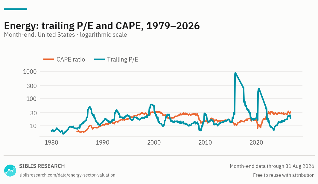
Trailing P/E and CAPE on one axis, drawn logarithmically. The P/E reached 905.9 in November 2015, when aggregate earnings neared zero — on a linear axis that single episode would flatten four decades into a line along the bottom. The gap between the two lines is the distance between what the sector earns now and what it earned across the decade.

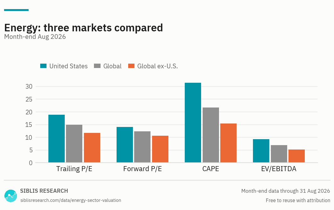
The same four measures, side by side in each market published. A premium that appears on P/E and on EV/EBITDA alike is not a statement about how these companies are financed.
| Year | Trailing P/E | CAPE |
|---|---|---|
| 2025 | 17.27 | 26.36 |
| 2024 | 13.53 | 27.05 |
| 2023 | 10.07 | 26.78 |
| 2022 | 8.79 | 31.71 |
| 2021 | 41.90 | 20.64 |
| 2020 | n/a | 11.63 |
| 2019 | 19.85 | 16.50 |
| 2018 | 18.09 | 14.82 |
| 2017 | 54.26 | 16.69 |
| 2016 | n/a | 15.37 |
The trailing P/E is shown as n/a where aggregate sector earnings were negative. The full monthly history from 1979, and the global and global ex-U.S. series, are available to subscribers.
United States, Sept 2026
U.S. sector against its own history
The contradiction, and which number to trust
EV/EBITDA looks at what the sector earns now. CAPE looks at what it earned over ten years, adjusted for inflation. When two measures disagree as sharply as these do, the disagreement is not noise — it is a statement about what happened during the decade.
At 8.69 times EV/EBITDA the sector is the cheapest of the eleven, and cheaper than 28% of its own readings since 1995. At a CAPE of 29.79 it is more expensive than 92% of its readings since 1984, against a median of 17.21. Its highest CAPE on record is 33.97, in March 2026.
Both calculations are correct, on the same day, on the same companies. The difference is entirely in the denominator.
What is inside the ten-year average
CAPE divides today's price by the average of ten years of inflation-adjusted earnings. For a reading at September 2026, that window reaches back roughly a decade — and it still contains 2020, when aggregate sector earnings were negative.
How severe that was is visible as a gap in the year-end table below: the trailing P/E cannot be published for December 2016 or December 2020, because in both years aggregate sector earnings were negative. A ratio with a negative denominator is not a valuation, so we print nothing rather than a number.
The 2015–16 collapse has now largely rolled out of the window. The CAPE is nevertheless at the 92nd percentile of its history, against a median of 17.21 — so the argument that this reading is purely an artefact of one bad decade has already been half tested, and the ratio did not come down with it.
What remains inside the average is 2020, and it will roll out too. When it does the CAPE will fall without a single share price moving. That is not a criticism of the measure — it is what the measure is for, refusing to treat one good year as permanent — but it means the number should be read with a calendar as well as a chart.
The range is not the statistic
The energy sector's trailing P/E has been as low as 4.94 (March 1982) and as high as 905.9 (November 2015). That high is not a valuation event. It is earnings approaching zero while prices stayed where they were.
A range whose top is set by a near-zero denominator carries no information, so describing a sector as sitting at some percentage of its range says almost nothing. Every comparison above is a percentile instead — the share of months in the sector's own history that were cheaper than today — which is unaffected by how extreme the extremes were.
Why the American premium is the third largest in the market
U.S. energy trades +57% above global ex-U.S. on trailing earnings and +67% above on EV/EBITDA. On CAPE the gap is +96%.
Two measures that treat debt differently — P/E ignores capital structure, EV/EBITDA prices it in — both show a large premium. That rules out financing as the explanation and points at composition: what is listed as energy in the United States is not the same collection of businesses as what is listed elsewhere.
The sector definitions are identical. The companies are not. That is a caution about the comparison rather than a reason to avoid it, but it means the premium should be read as a difference in what you are buying, not as a mispricing.
Choosing a measure
No single ratio answers every question about a sector. Each of these pages covers the same eleven sectors — what changes is the question the measure is good at, and how far the coverage reaches.
| Measure | The question it answers | Why that one |
|---|---|---|
| EV/EBITDA | How does one sector compare across markets? | Sits above tax and debt, so it survives crossing borders. The only measure here that makes an international sector comparison sound. |
| P/E and earnings | How fast are a sector’s earnings growing? | Trailing and forward multiples with the earnings behind them, so the multiple and its denominator can be read together. |
| CAPE | Is a sector expensive against its own history? | Averages a decade of real earnings, which smooths the cycle out of the denominator. |
| Price to book | What is the market paying for the assets? | Works where earnings-based measures break down — asset-heavy sectors, and banks in particular. U.S. sectors only. |
| Dividend yield | Which sectors pay, and how much? | Income rather than valuation, but it moves inversely with price and is read alongside the multiples. U.S. sectors only. |
Communication Services · Consumer Discretionary · Consumer Staples · Financials · Health Care · Industrials · Technology · Materials · Real Estate · Utilities
All eleven side by side: sector valuations. To compare them on one measure: P/E and earnings · CAPE ratios · EV/EBITDA · Dividend yields · Price to book.
Where this data is used
Some examples. Siblis valuation data appears in peer-reviewed journals, central bank publications and the financial press.
The whole energy history, every trading day
This page publishes ten year-ends and the current reading. The database carries every month back to 1979, for all eleven sectors and every market.
How this is calculated
Every ratio is calculated on the aggregate: the total market capitalisation of the sector's constituents divided by their aggregate earnings, book value or EBITDA, rather than as an average of the constituents' own ratios.
- Trailing P/E — Aggregate normalised net income over the previous twelve months. Major purely accounting gains and losses are removed.
- Forward P/E — Consensus estimates for the next twelve months, aggregated the same way.
- CAPE — Price divided by the average of ten years of inflation-adjusted aggregate earnings.
- EV/EBITDA — Enterprise value over EBITDA, a monthly snapshot rather than a daily calculation.
- Coverage — U.S. series from 1979; global and global ex-U.S. from 1997. The three are comparable as levels but not as history, because they do not span the same period.
- Earnings growth — Calculated on aggregate sector earnings, not a per-share figure, so it is unaffected by buybacks. The one-year figure compares two month-ends. Rates over five years and longer compare the average of the twelve months at each end, so that one unusual month at the start does not set the whole rate.
- Percentiles — The share of month-ends in that series' own history with a lower reading than the current one.
- Revisions — Figures are point-in-time. If a company later restates its results, the historic reading is left exactly as first published.
Cite this page
Siblis Research. (2026). Energy Sector P/E, CAPE & EV/EBITDA [Data set]. Retrieved 30 September 2026, from siblisresearch.com/data/energy-sector-valuation/
@misc{siblis_energy_sector_valuation,
  title={Energy Sector P/E, CAPE & EV/EBITDA}, author={{Siblis Research}},
  year={2026}, url={https://siblisresearch.com/data/energy-sector-valuation/},
  urldate={2026-09-30}}
Charts on this page may be reproduced free of charge with attribution to Siblis Research and a link to this page.